Summary
Goal: The Gardenio’s goal is to connect users to the people, information, and supplies they need to become ethical and sustainable life-long gardeners.
Situation: There is no organized, specialized place for novice gardeners to seek resources and help each other out.
Solution:
- a learning space for novices to improve skills
- a community space for users to talk to each other
- a reputation system to motivate experts to engage in the community
Business model canvas
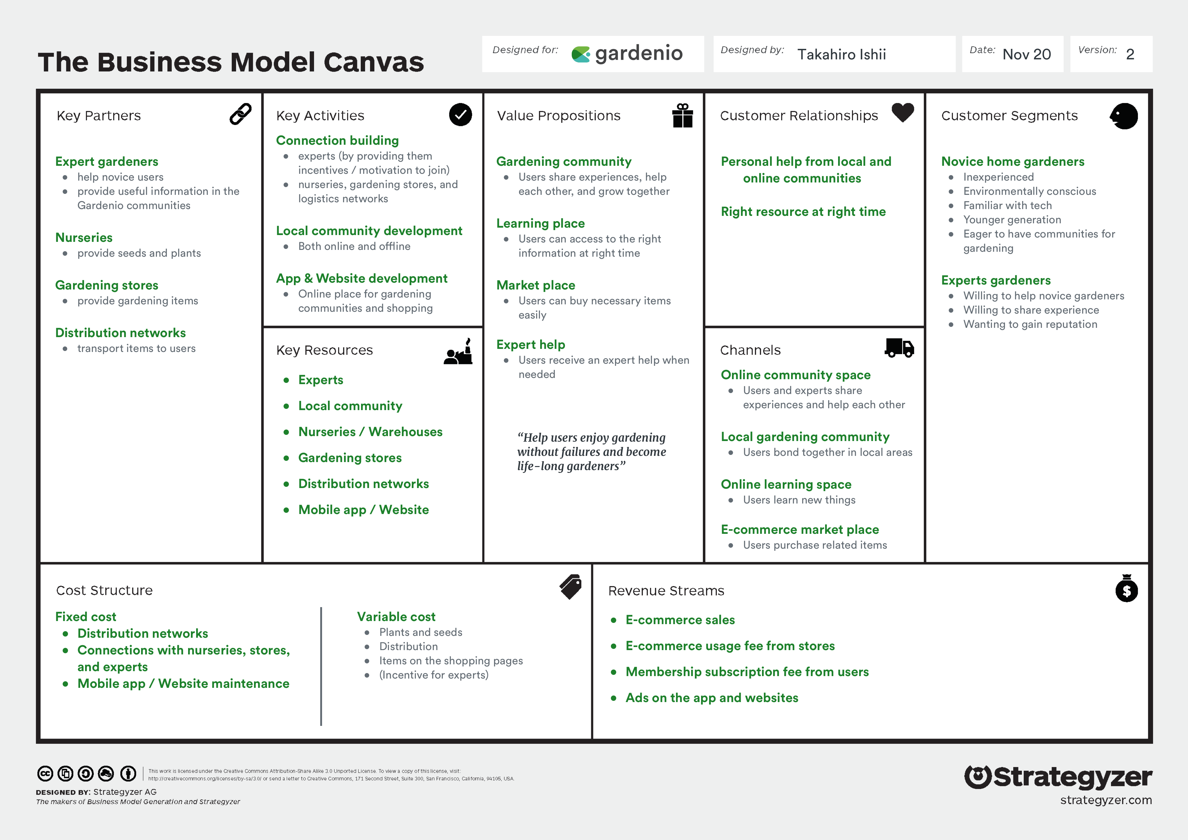
To better understand the vision, I created this business model canvas through discussions with its CEO, Roman Gonzalez.
Key takeaways:
- The target users are novice home gardeners, but also it also needs experts to help the novices.
- Gardenio builds both global online space and local communities for gardeners.
- The community connects users with resources including other users, gardening items, and learning systems.
Design sprint map
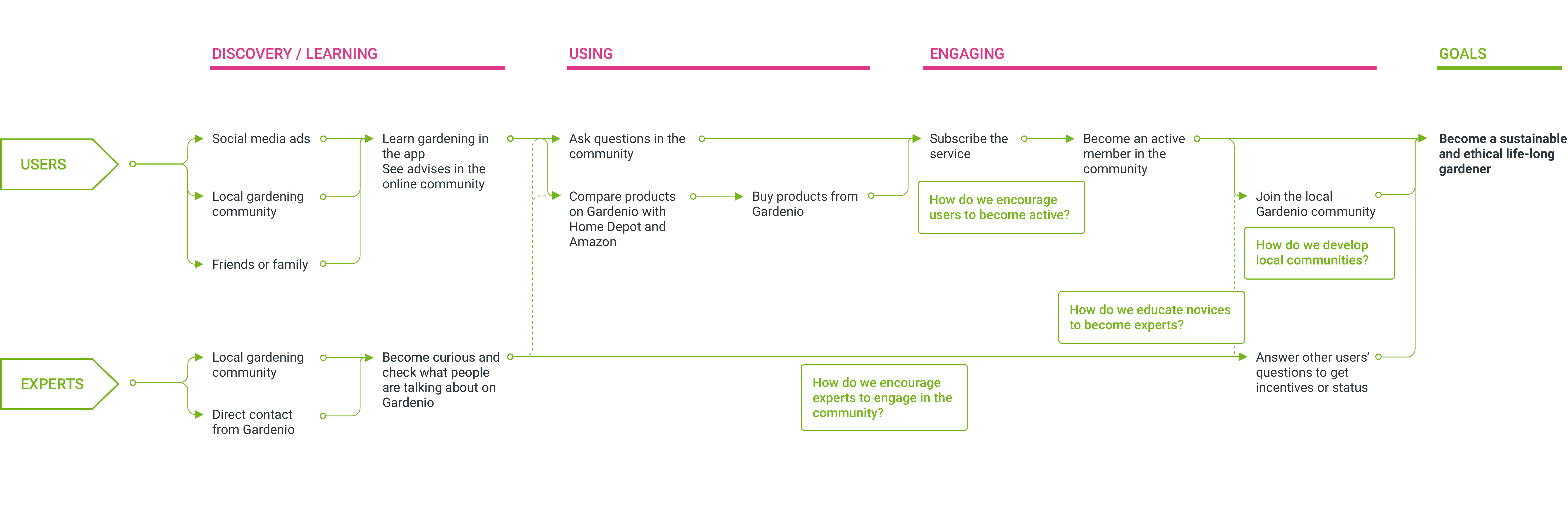
To visualize their vision and find current problems, I mapped out the user journey of becoming sustainable and ethical life-long gardeners.
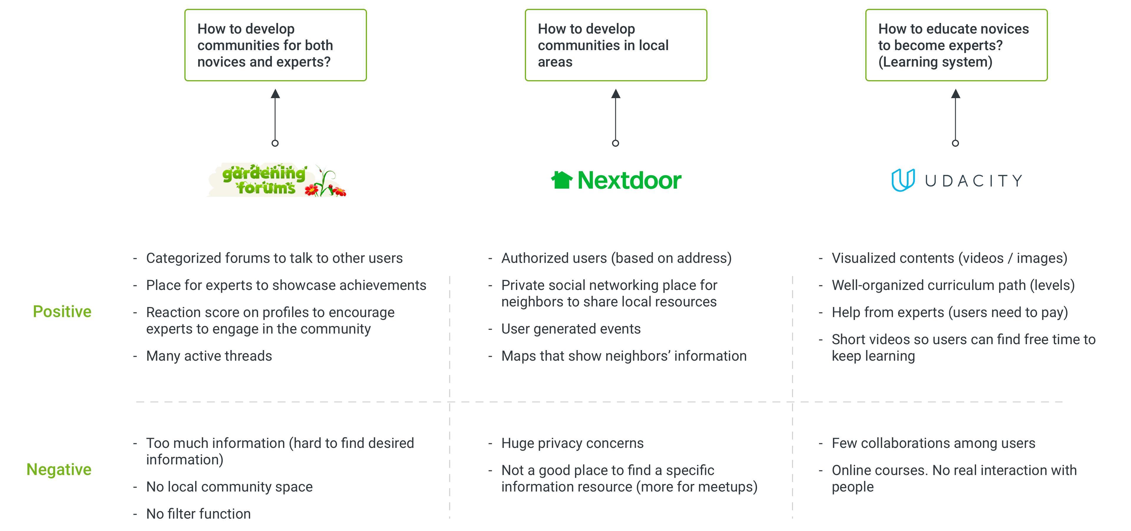
Here, we’ve got four issues we need to solve, but these can be categorized to three bigger sprint questions.
- How to develop communities for both novices and experts?
- How to develop communities in local areas?
- How to educate novices to become experts?
Design requirements
Community for novices and experts
- Online forum for each category
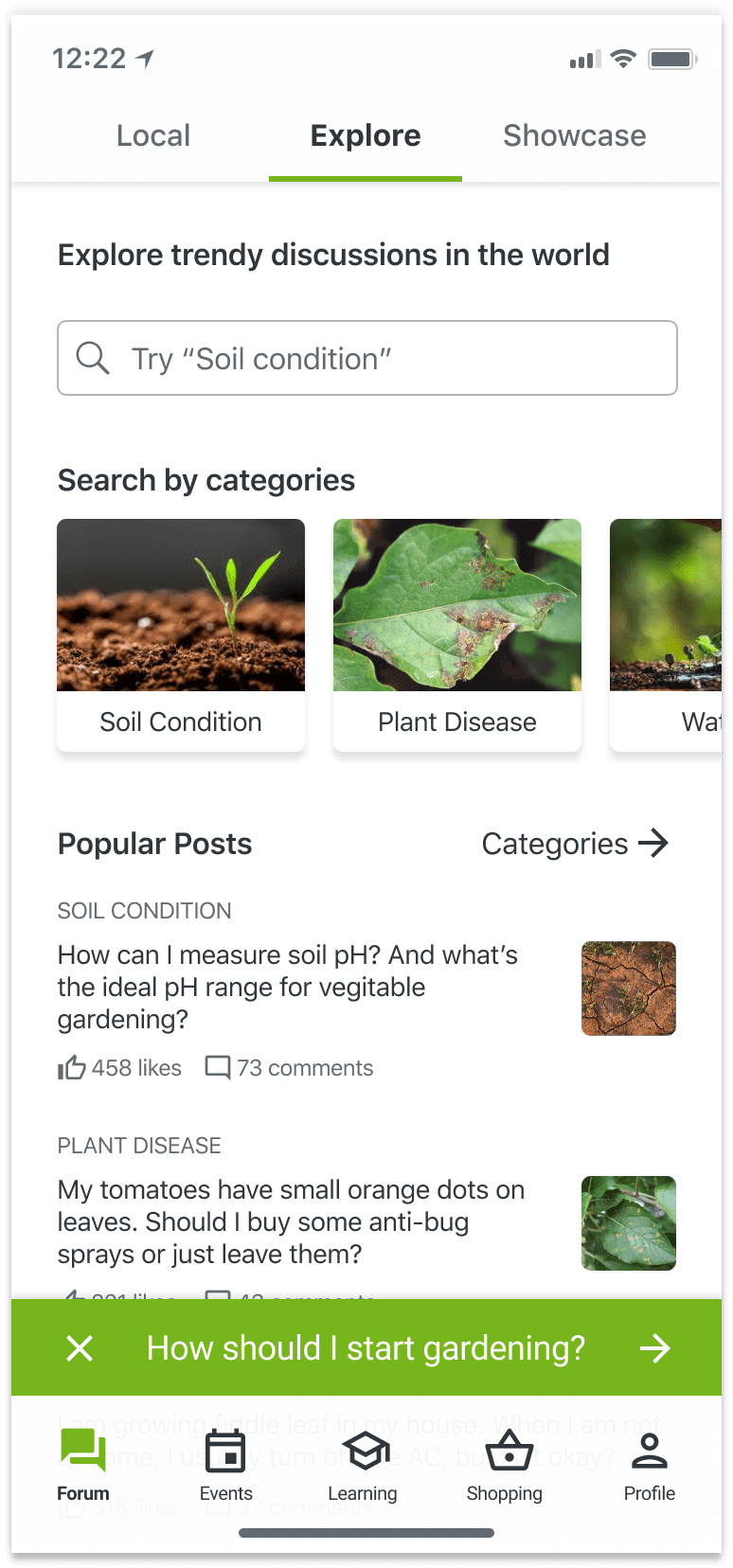
- Explore functions for discussions
- Showcase place (for experts)
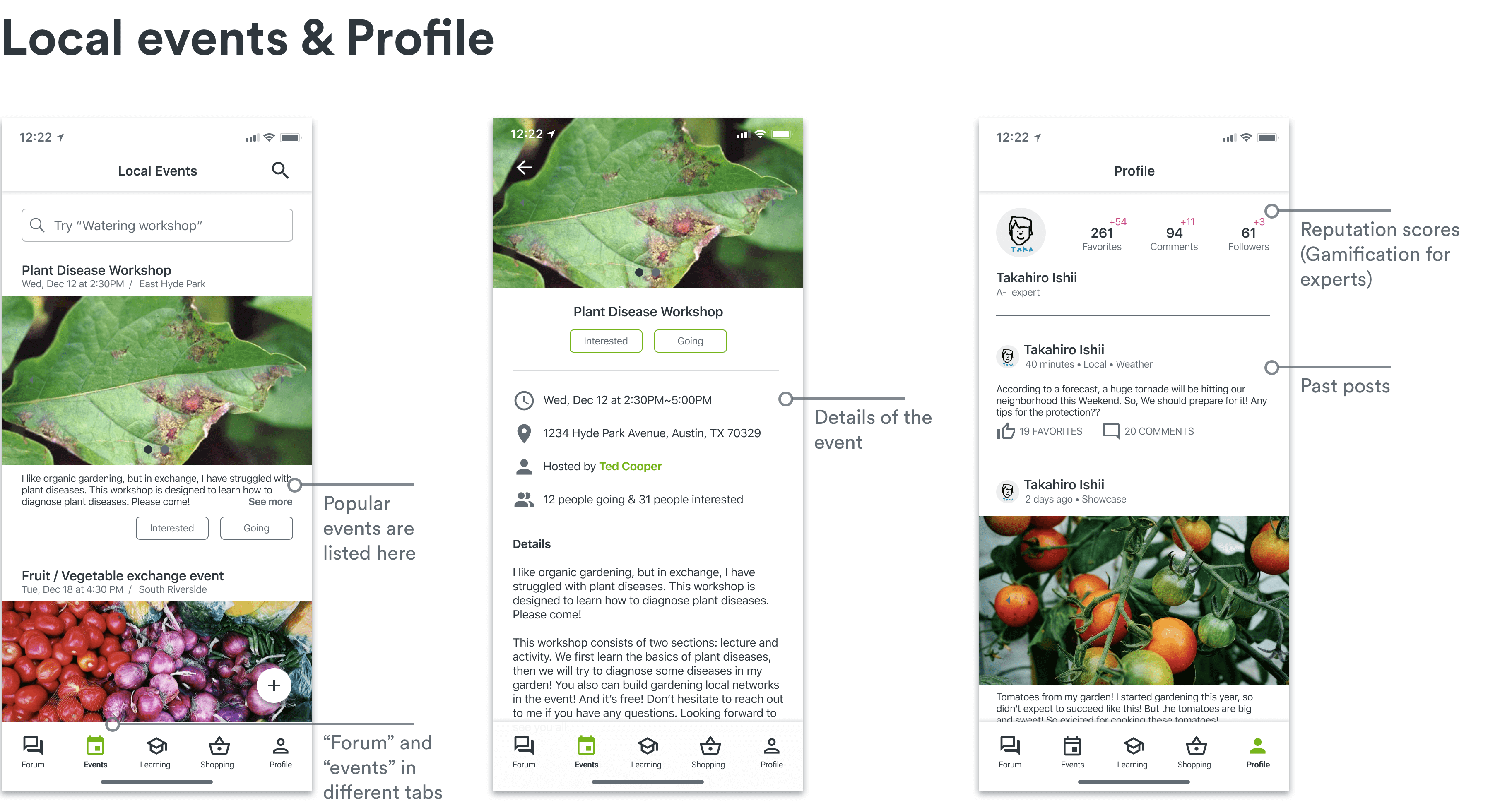
- Profile reputation
Local community space
- Local discussion forum
- User-generated local events
- User authorization with address
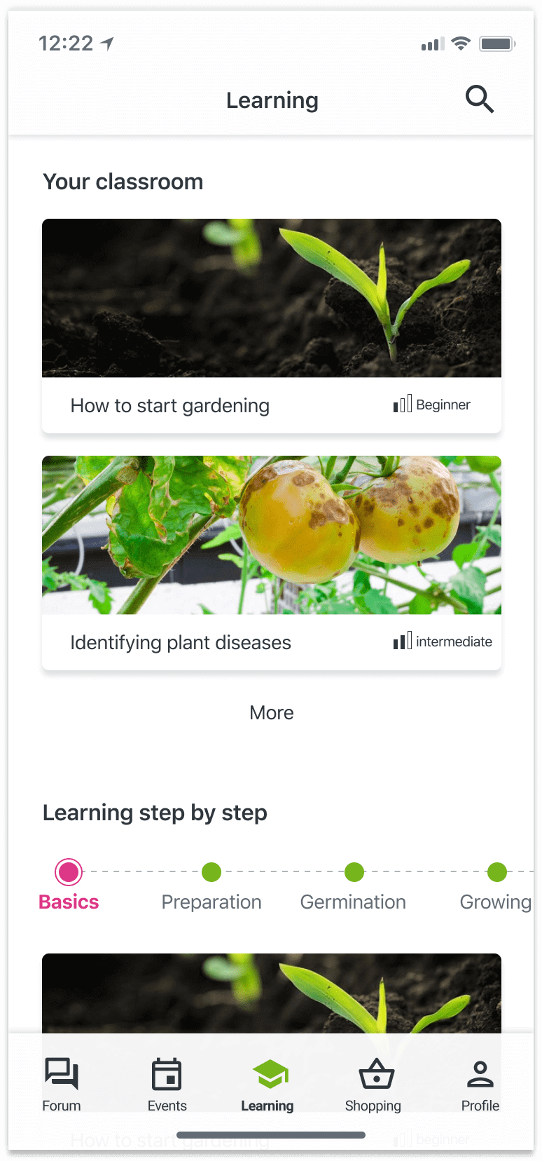
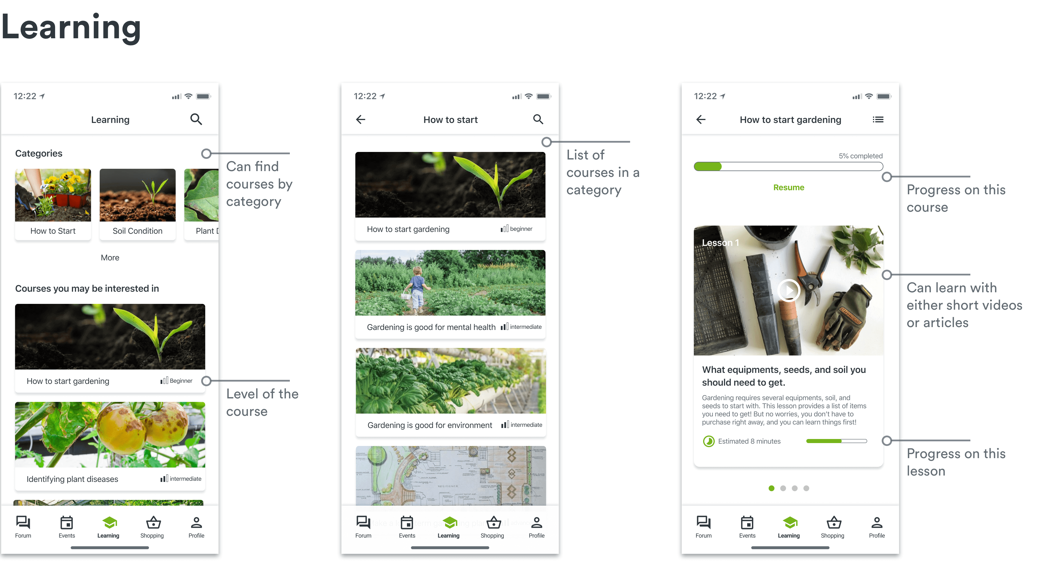
Learning system for novices
- Clear learning curriculum
- Lessons with short videos/articles
- Help from experts and other users
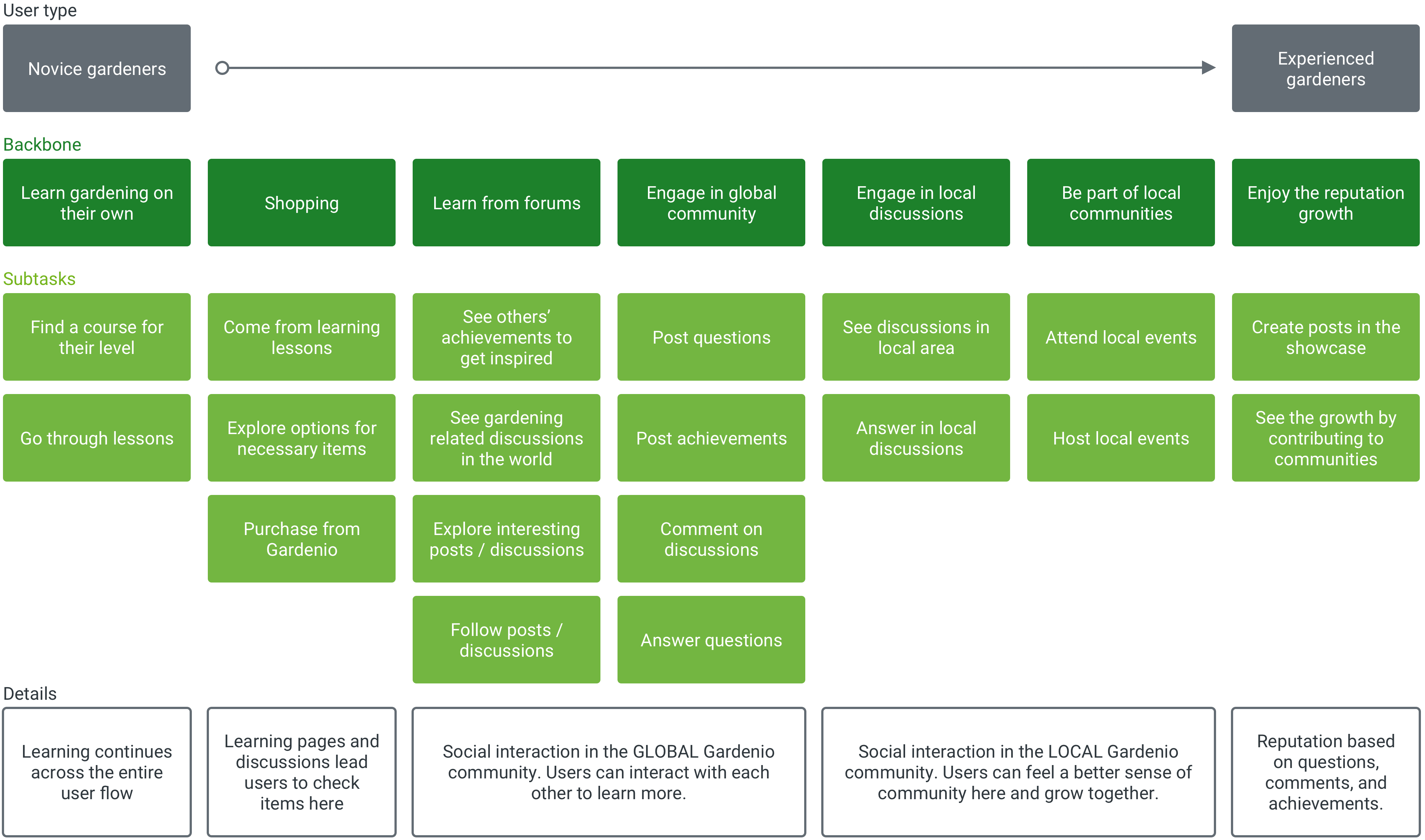
Story mapping
Based on user types and scenarios, I visualized the basic user flow through story mapping. Detailed descriptions can be found here.
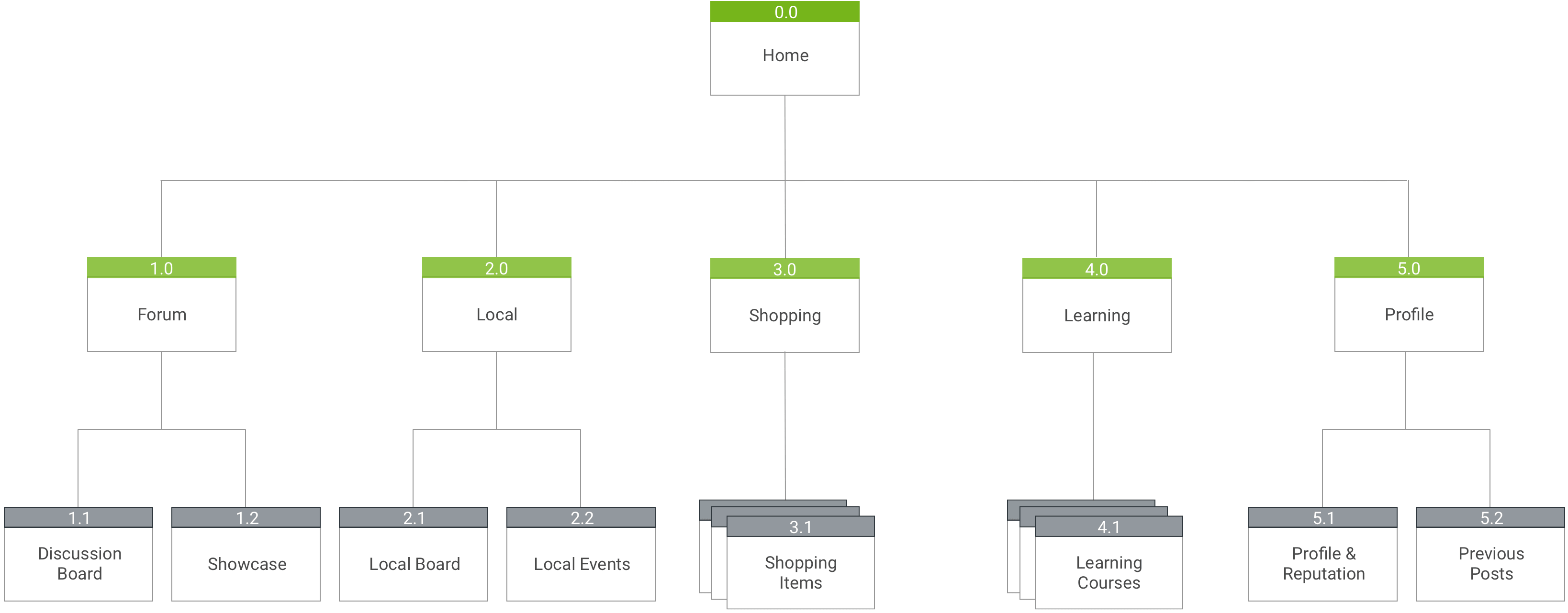
Information architecture
I visualized the structure here, based on the story mapping. This is the “initial” IA and will be revised later.

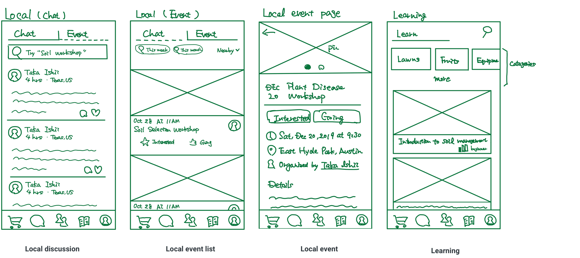
LoFi prototyping
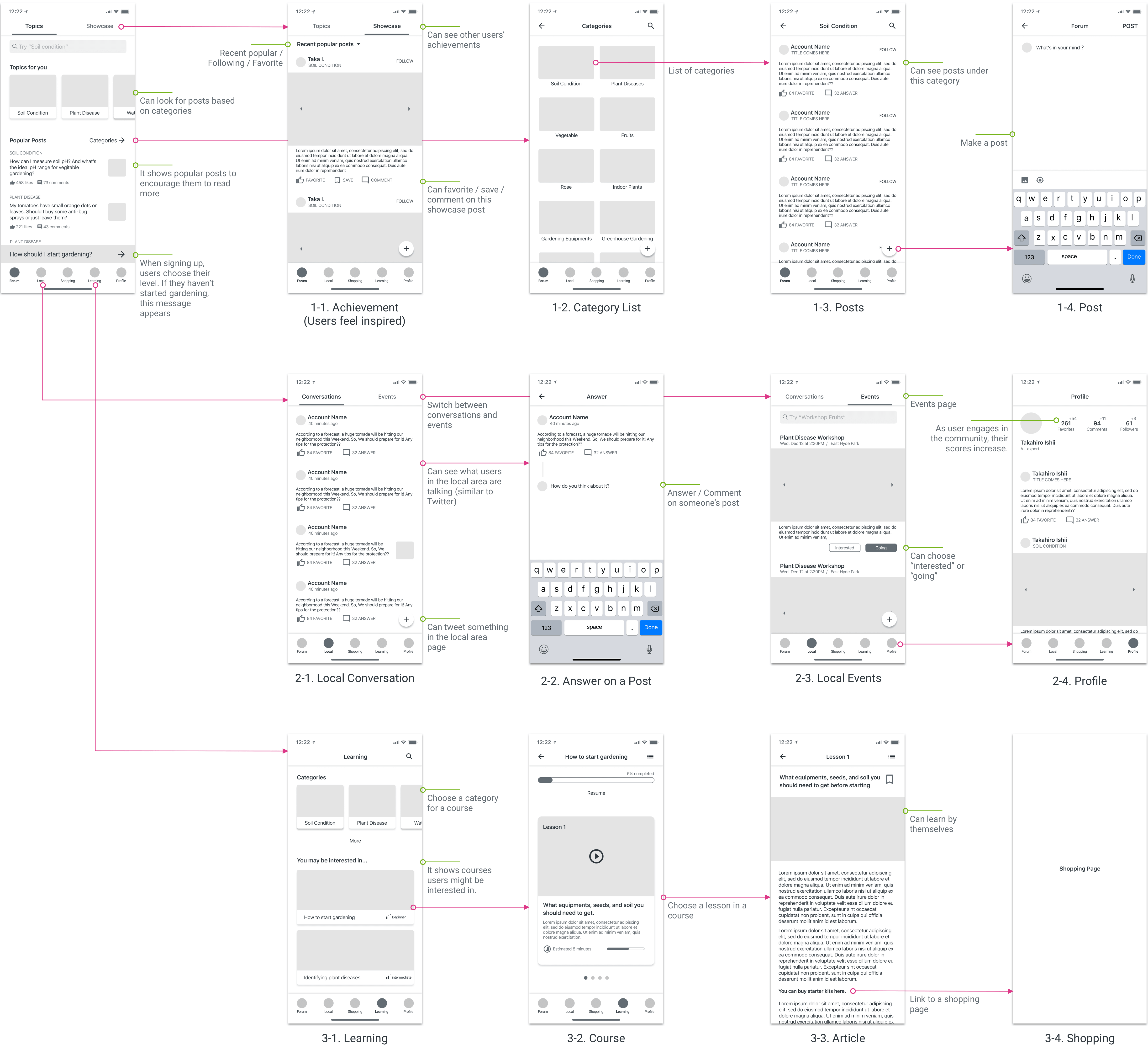
It shows some LoFi screens and the flow. There are three main flows.
- Get inspired by showcase posts, then explore posts to learn.
- Engage in local discussions, attend local events, and see the scores increased.
- Choose a course to learn, then take lessons.
RITE testing
I conducted user interviews and then user testing with four scenarios.
0. First impression: The user just installed the app after reading the app description. He tries to figure out the main functions.
1. Learning: The user is interested in gardening, but currently doesn't have any knowledge. So, he wants to learn basics.
2. Asking a question: The user got a question, so looked for information in the previous discussions, but couldn't find it. So, he creates a new question.
3. Attending a local event: The user feels lonely gardening only by himself. To make a connection and improve knowledge, he plans to attend a local event.
Here are some main design changes.
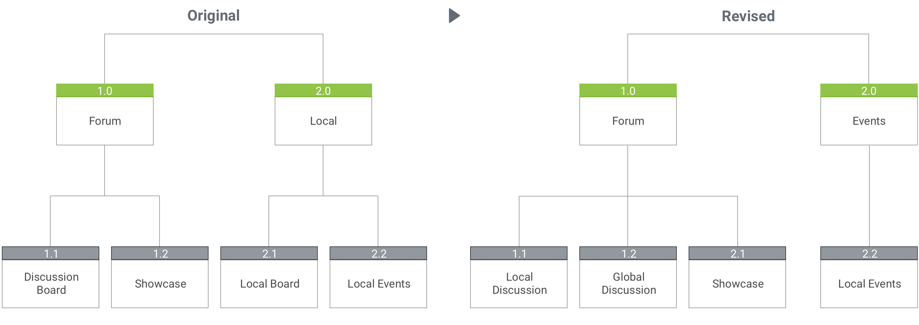
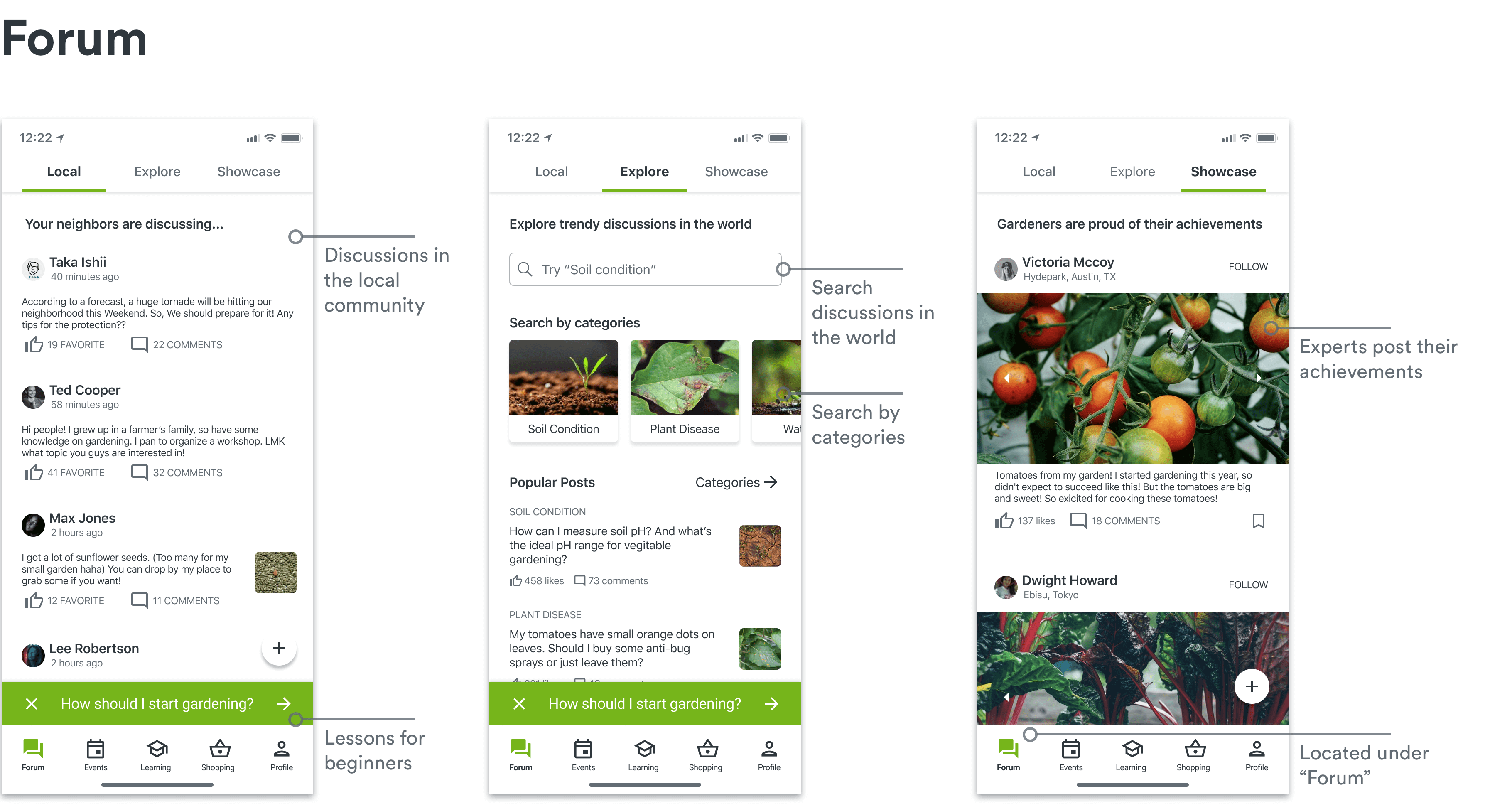
IA change: The participants got confused about the difference between (global) discussion board and local board because the UI and the concept were similar. So, the new idea combined them into “forum”.
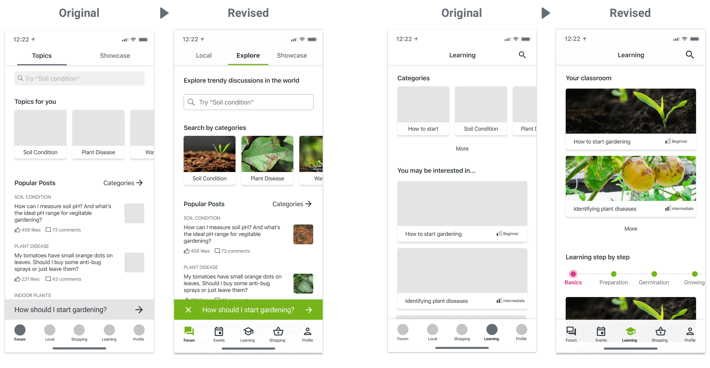
Shopping & Learning: Since the participants mentioned 1) learning is more important, and 2) if shopping is the main function, they wouldn't use this app, I switched their locations.
UI design changes:
1. First-time users got confused about the difference between each tab, so I added a little description at the top.
2. Instead of seeing the general categories and potential courses, they wanted to see courses based on the gardening steps.
