Summary
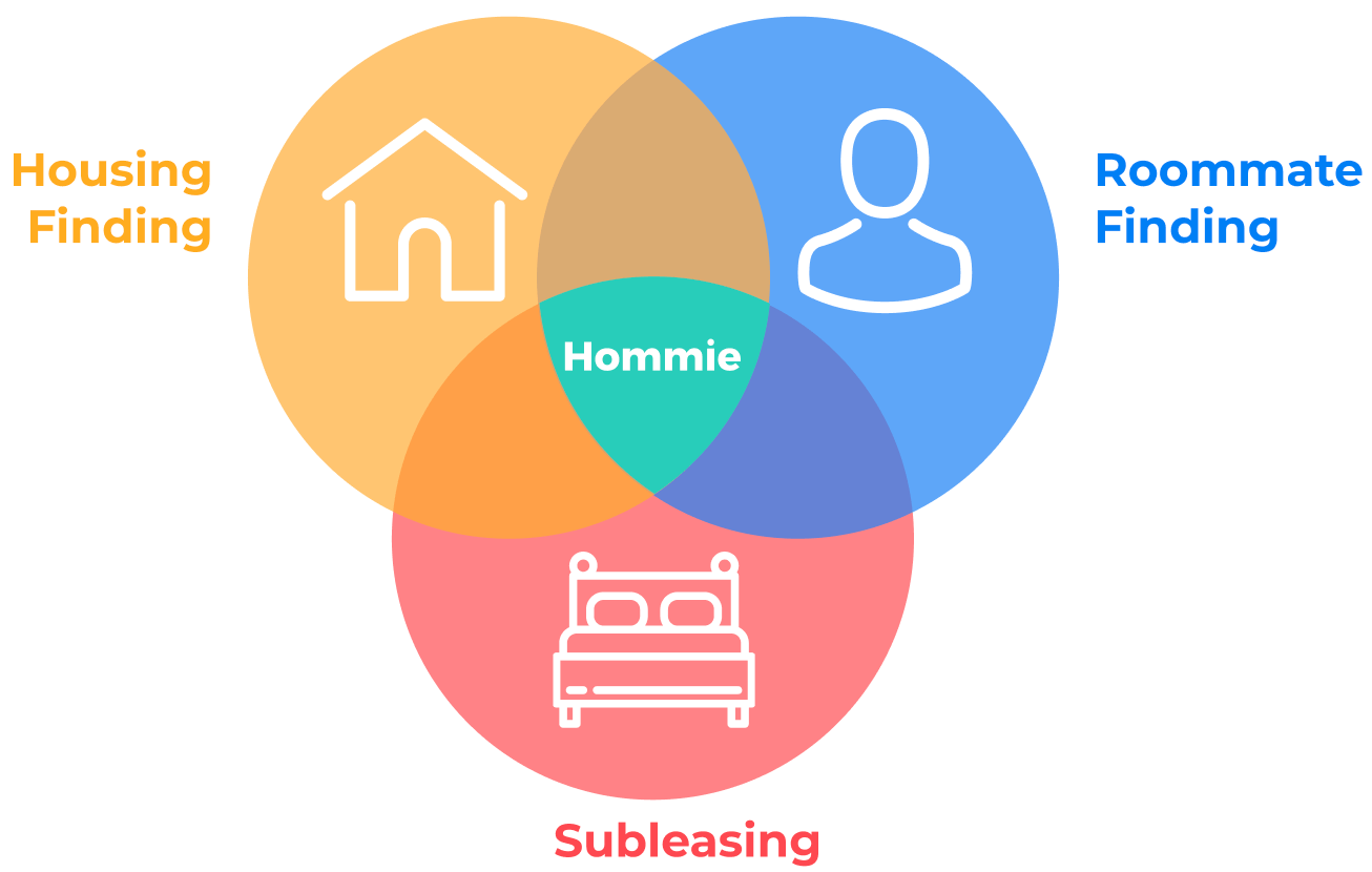
[Problem] Looking for housing & roommates is a distressing experience for college students.
[Solution] We designed an integrated website to help users quickly find housing & roommates
[Process] Competitive Analysis, User Research, Information Architecture, Prototyping, and Usability Testing.
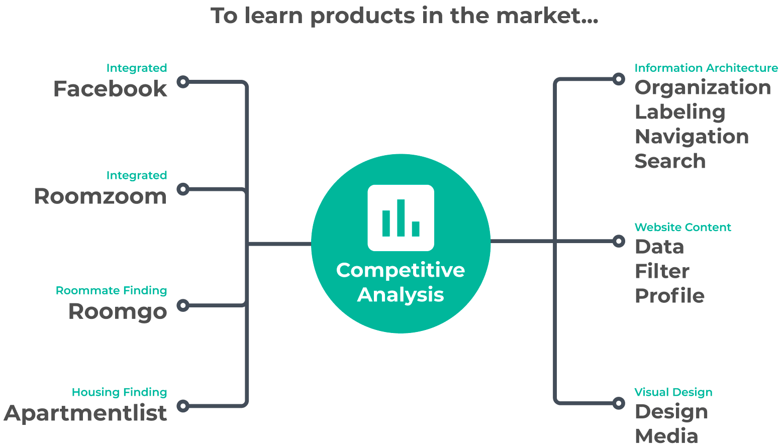
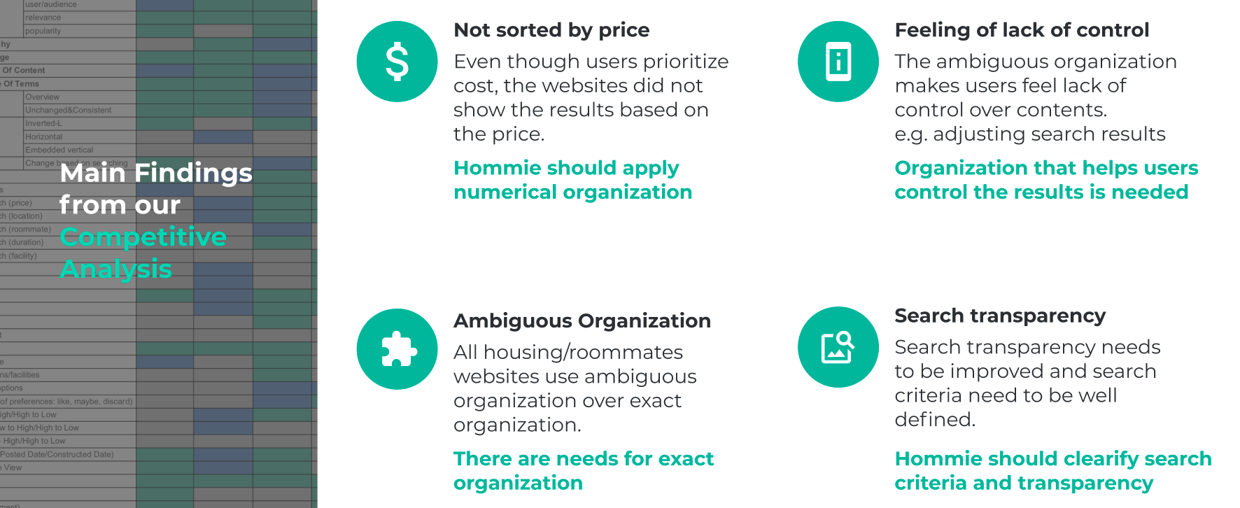
Competitive Analysis
We conducted competitive analysis to see what other products are available for college student to look for housing and roommates. I investigated four apps, and summarized the results. There are three types of websites;
- Integrated website: they cover both housing and roommate finding in one application
- Housing finding: they specifically focus on housing
- Roommate finding: they specifically focus on roommate finding
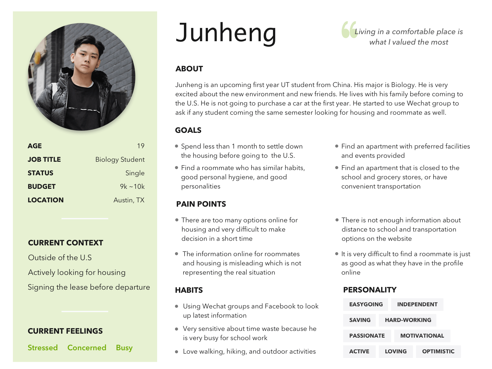
Persona
We conducted 8 user interviews with students to learn about their pain points and desires. Our interviews asked about
- Demographics & Background
- Housing finding experiences
- Roommate finding experiences.
Based on the interviews, we generated an affinity diagram, a persona and journey maps.
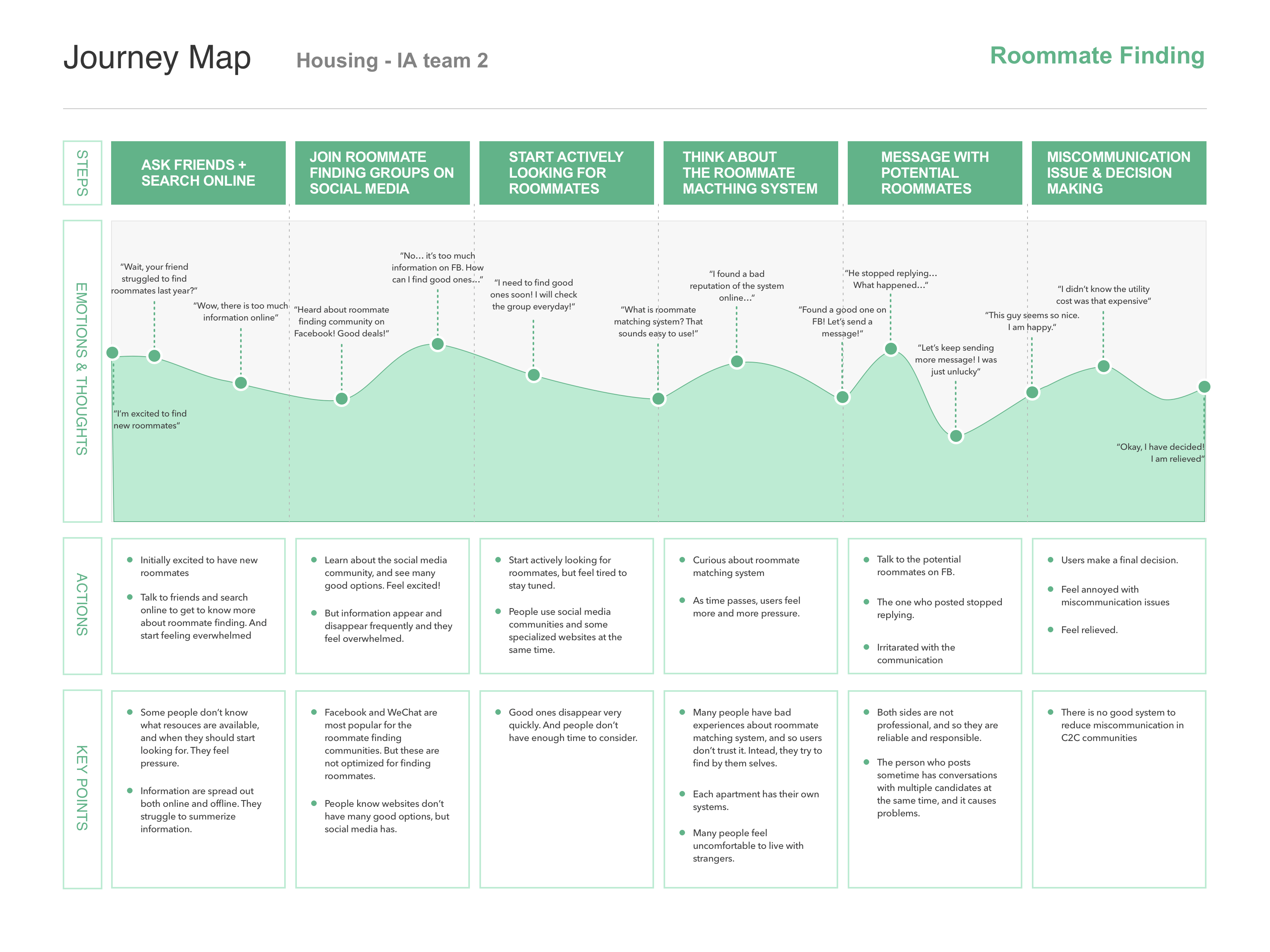
Customer Journey
Based on the previous user research, our team created three customer journey maps as shown below. Here is my creation as an example.
- Housing Finding
- Roommate Finding
- Subleasing
Housing Finding
- Websites have different ways to search and show results, which makes users feel confused.
- They need to re-confirm the information from multiple sources to make sure they are making the right decision.
Roommate Finding
- They tend to use social media, but posts appear and disappear frequently, and so they struggle to keep on track.
- They often feel frustrated with miscommunication issues.
Subleasing
- They feel that social media is an easy place to post subleases.
- They feel happy when they find potential people to take your place, but they often feel irritated with miscommunication issues.
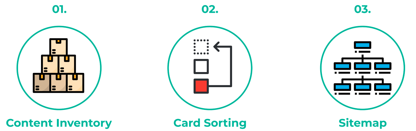
Information Architecture
To define our information architecture, we conducted sessions for
- Content Inventory: to think of what to include in our website.
- Card Sorting: to create and refine information architecture.
- Sitemap: to visualize our architecture.
Content Inventory
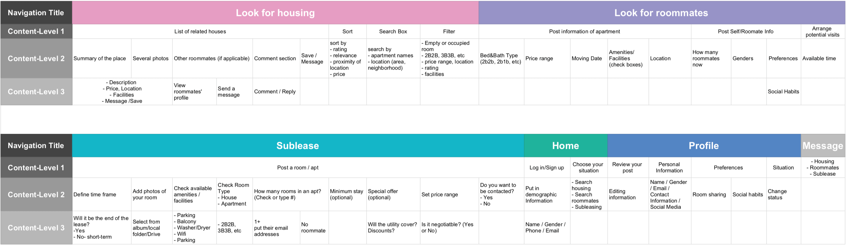
We defined defined four levels of navigation for the content and the initial structure of our website. (It will be revised later.) Also, there are six global navigation - Look for housing, Look for roommates, Sublease, Home, Profile, and Message.
Card Sorting
We conducted a card sorting activity to define our sitemap. We gave global category cards, and participants organized cards based on that. One of the findings was searching for roommates and housing is a non-linear process, one doesn’t necessarily have to follow another. Thus, we decided to have "search housing" and "search roommates" separately.
Sitemap (the final version)

Based on the card sorting activities, we created a sitemap to . visualize our function structure. Main functions are:
- Search Housing: Users can search empty rooms and rooms that some residents already live.
- Search People: Users can search individuals to live with, or groups of people with similar interests to find an apartment together.
- List Your Property: Users can post their place to find roommates to join their place or sublease their place.
Besides main functions, there are three sub functions to help users find housing and roommates smoothly:
- Profile: Users can edit their profile and housing / roommate preferences, so that our system can suggest best housing and roommates. Also, others can find the best matches.
- Message: Users can communicate with other individual users or members in groups.
- Saved List: Users can see saved housing or roommate posts.

Even though our original structure better fit into the data structure (engineers' mental model), our user testing informed that it was not intuitive for users, so I made a change as shown here. In the revised structure, the concept is easier to understand.
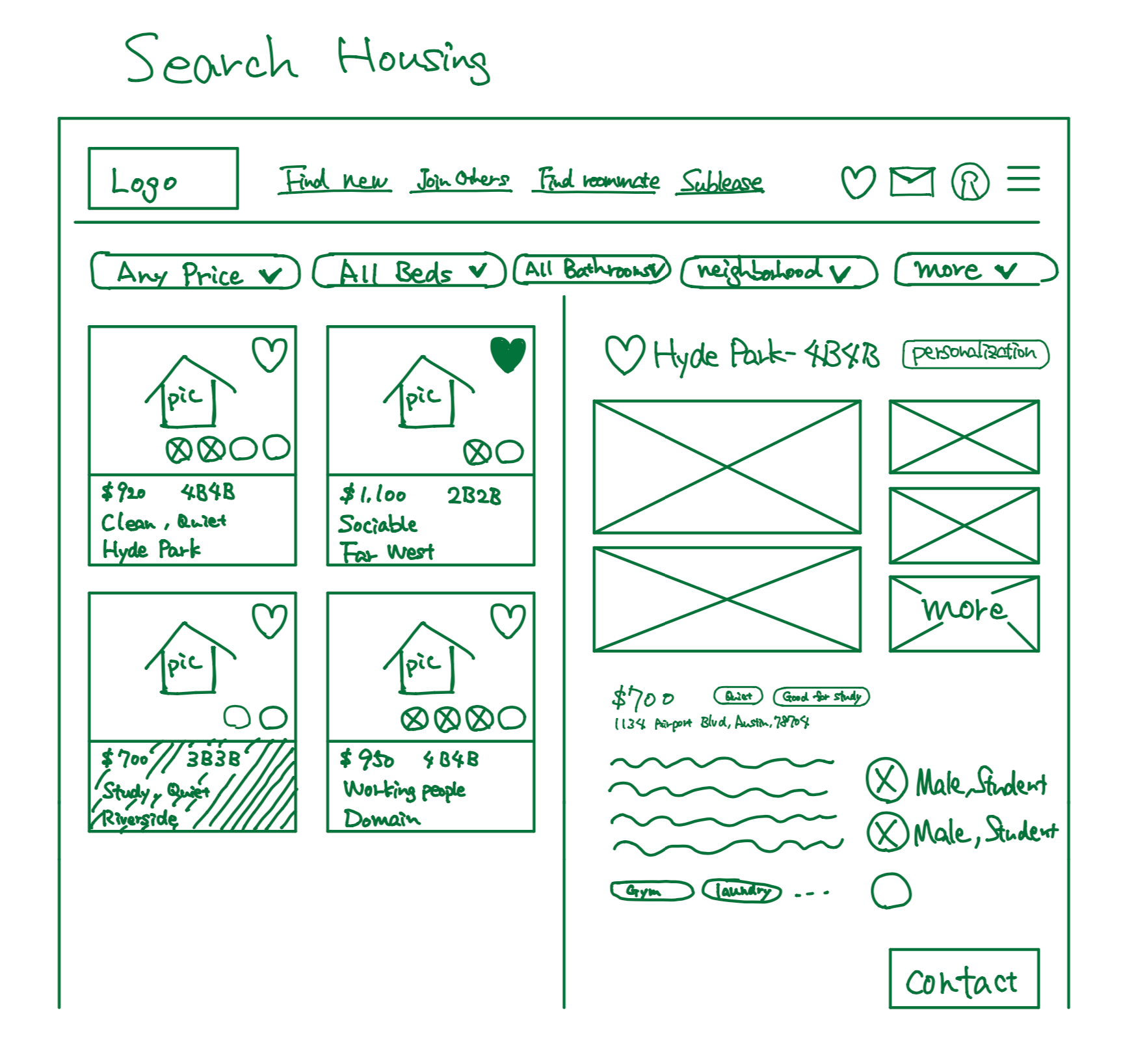
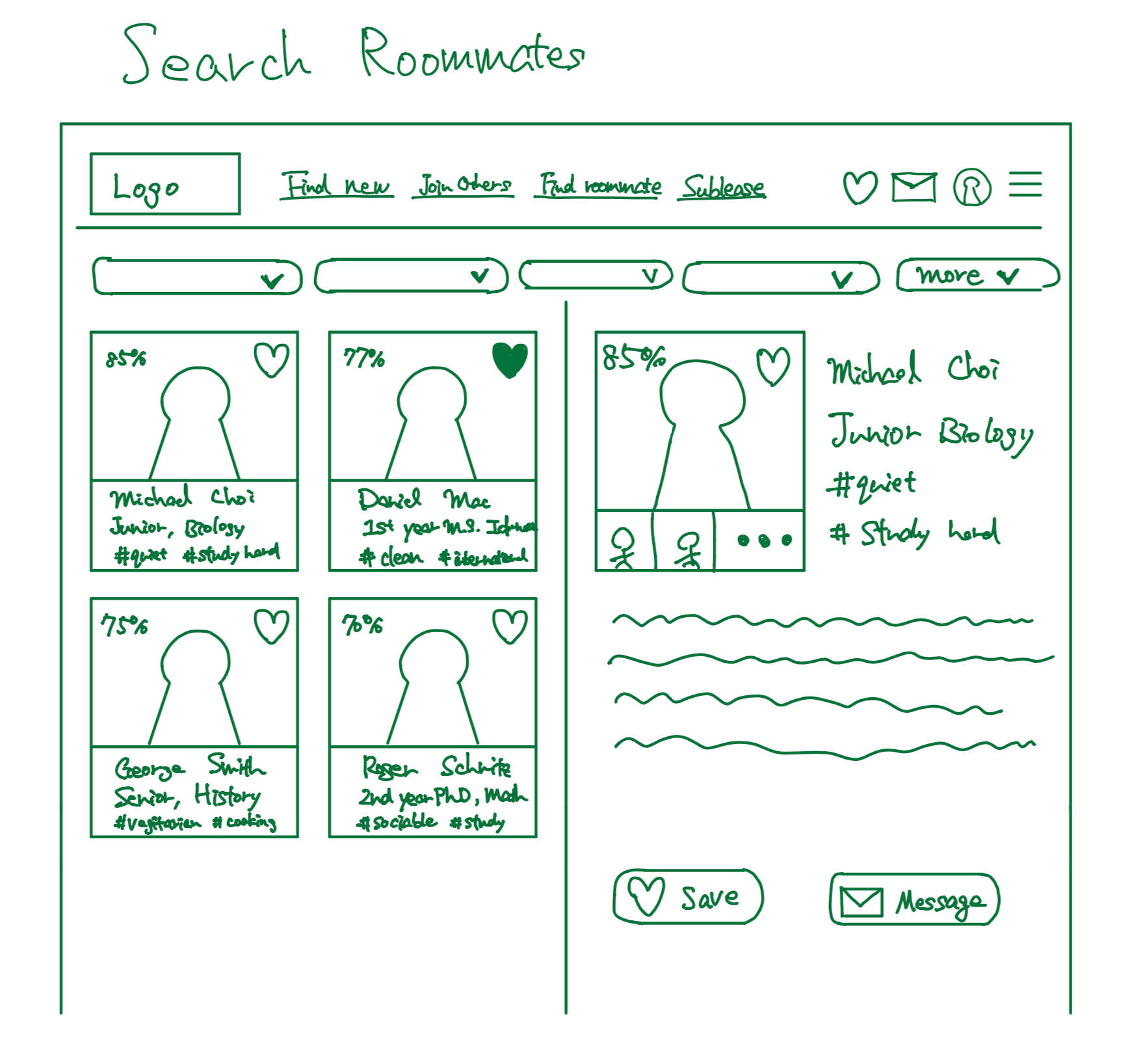
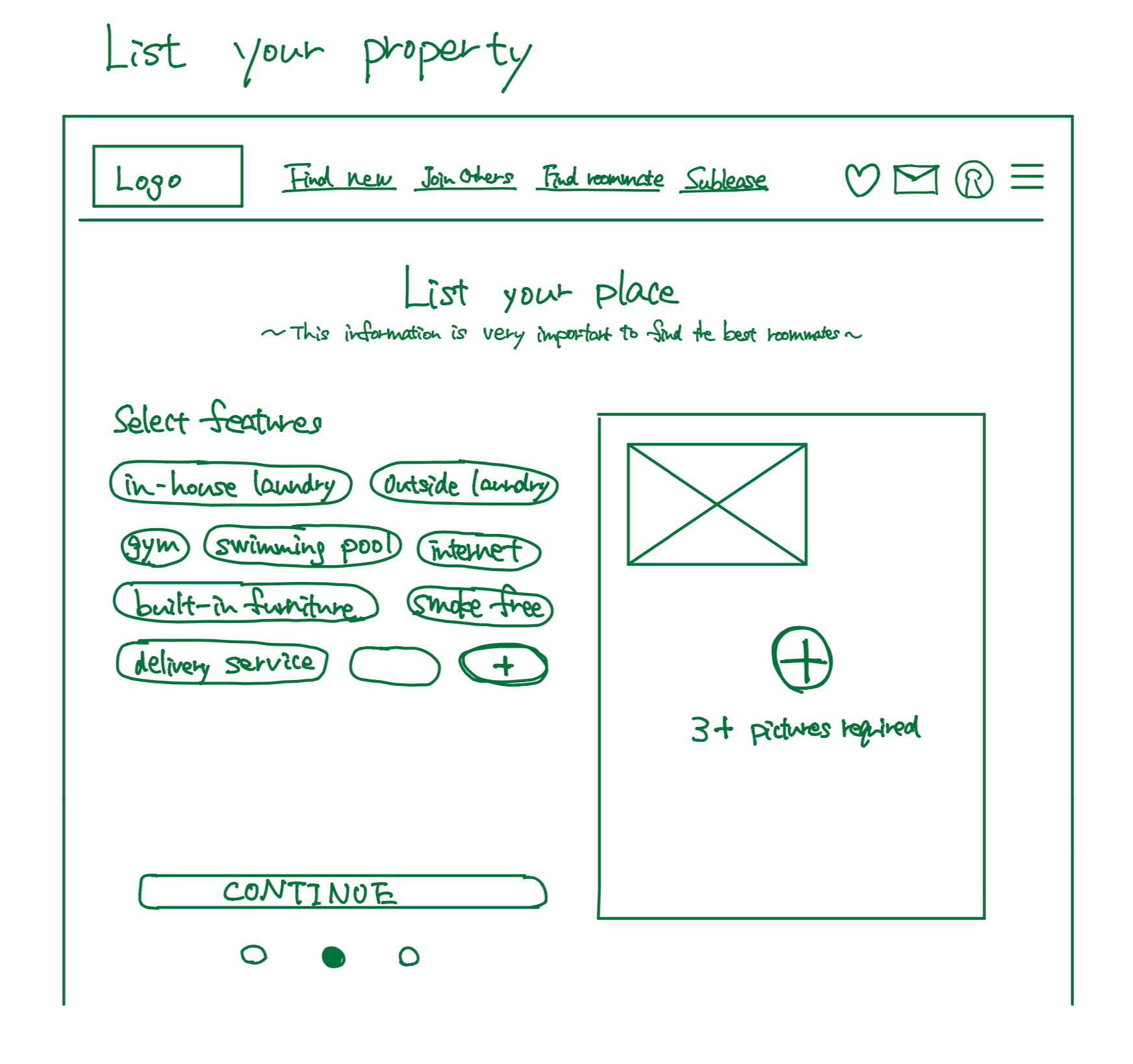
Sketching
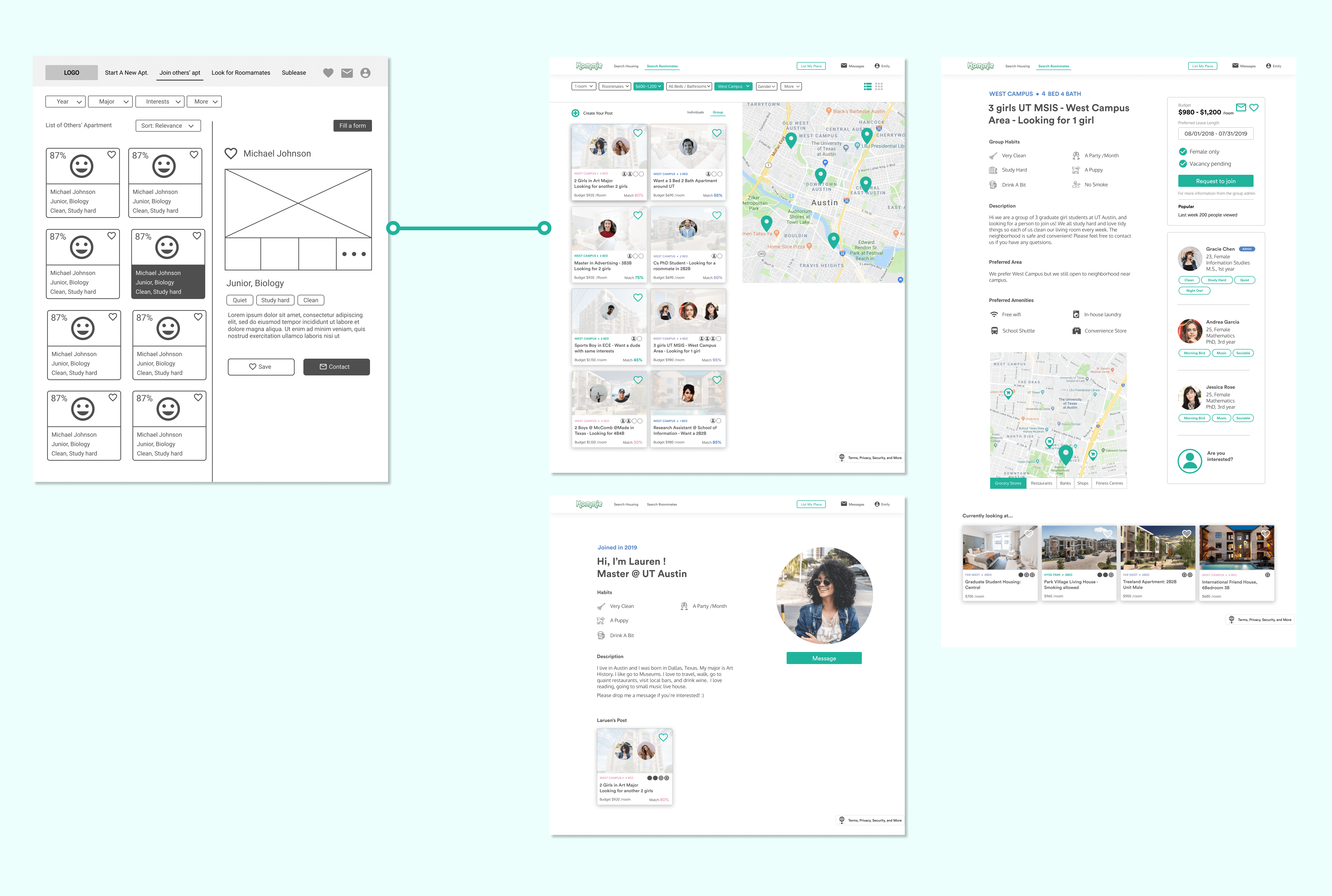
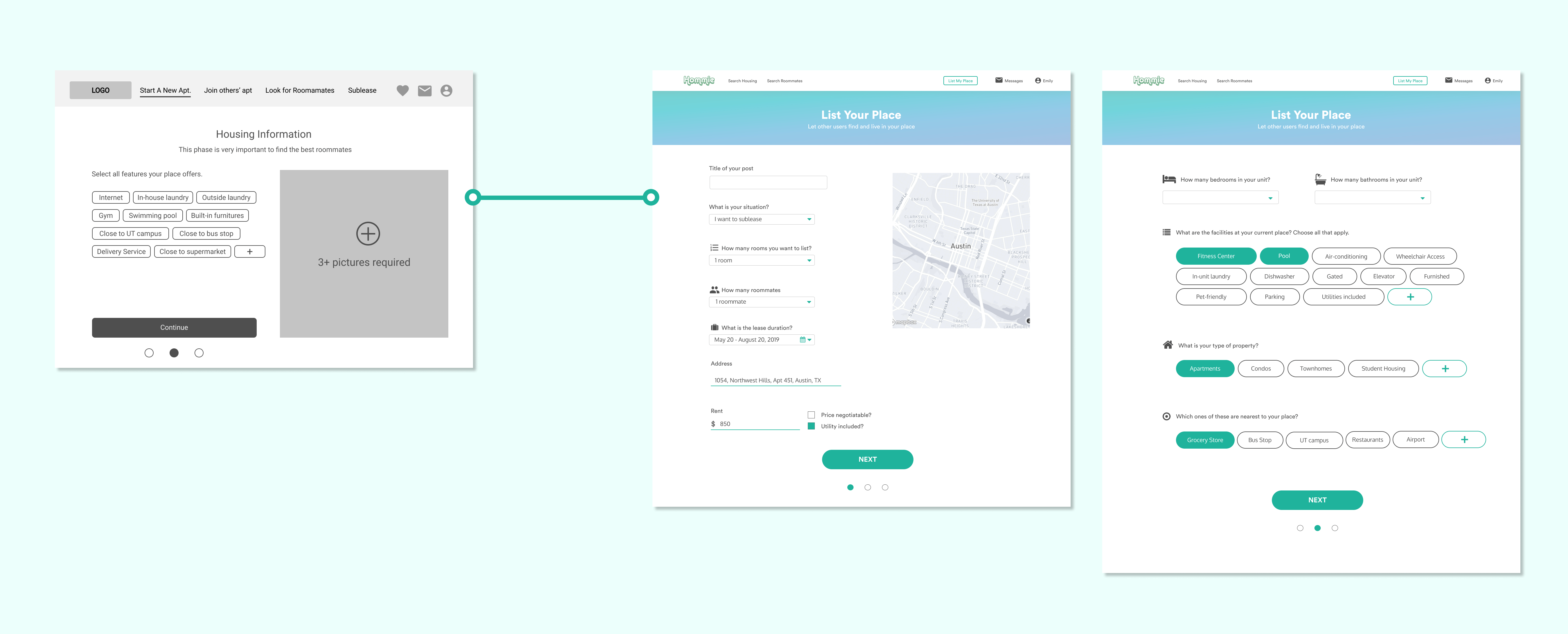
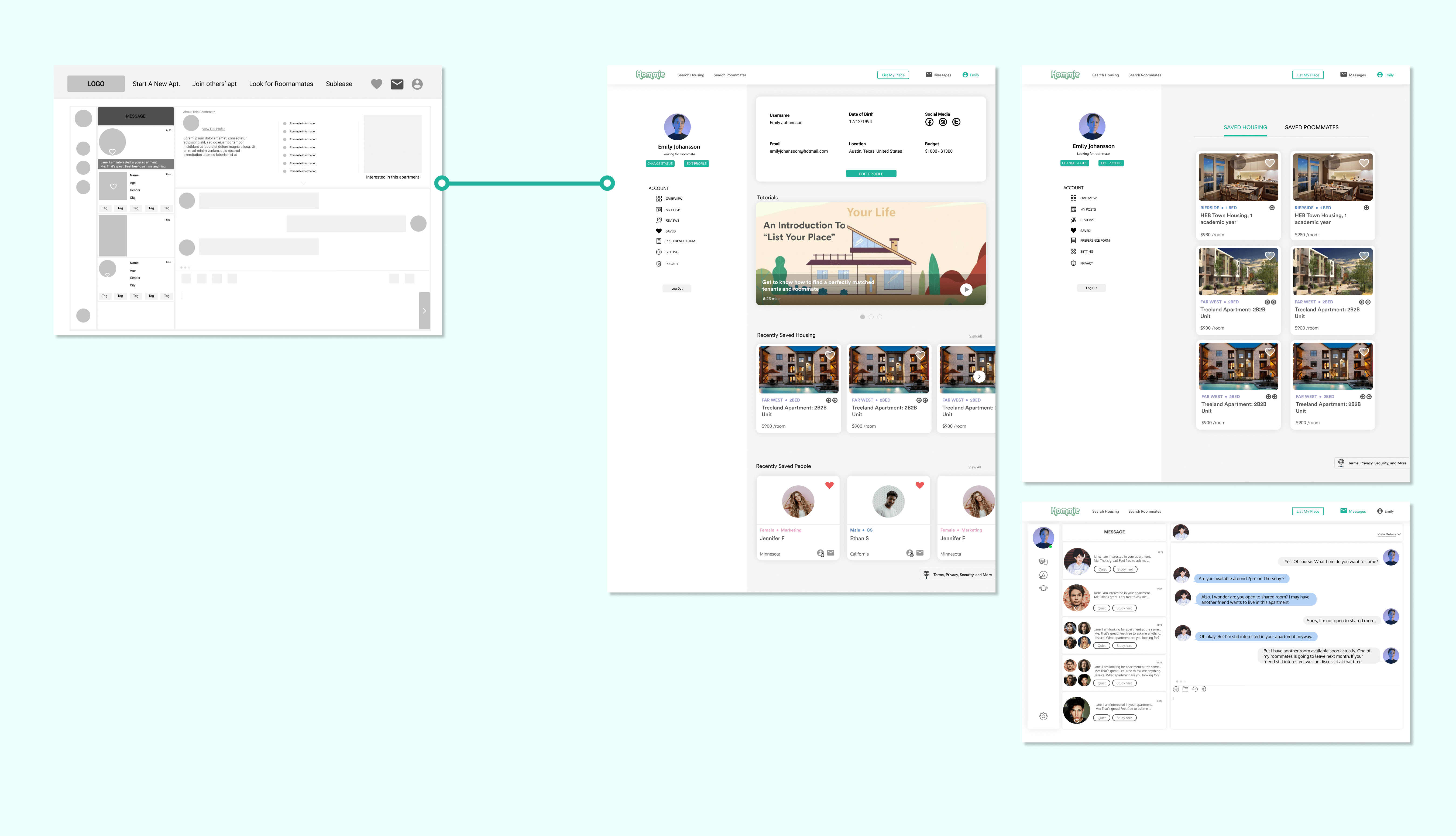
These are some of my sketch works for main functions based on our information architecture:
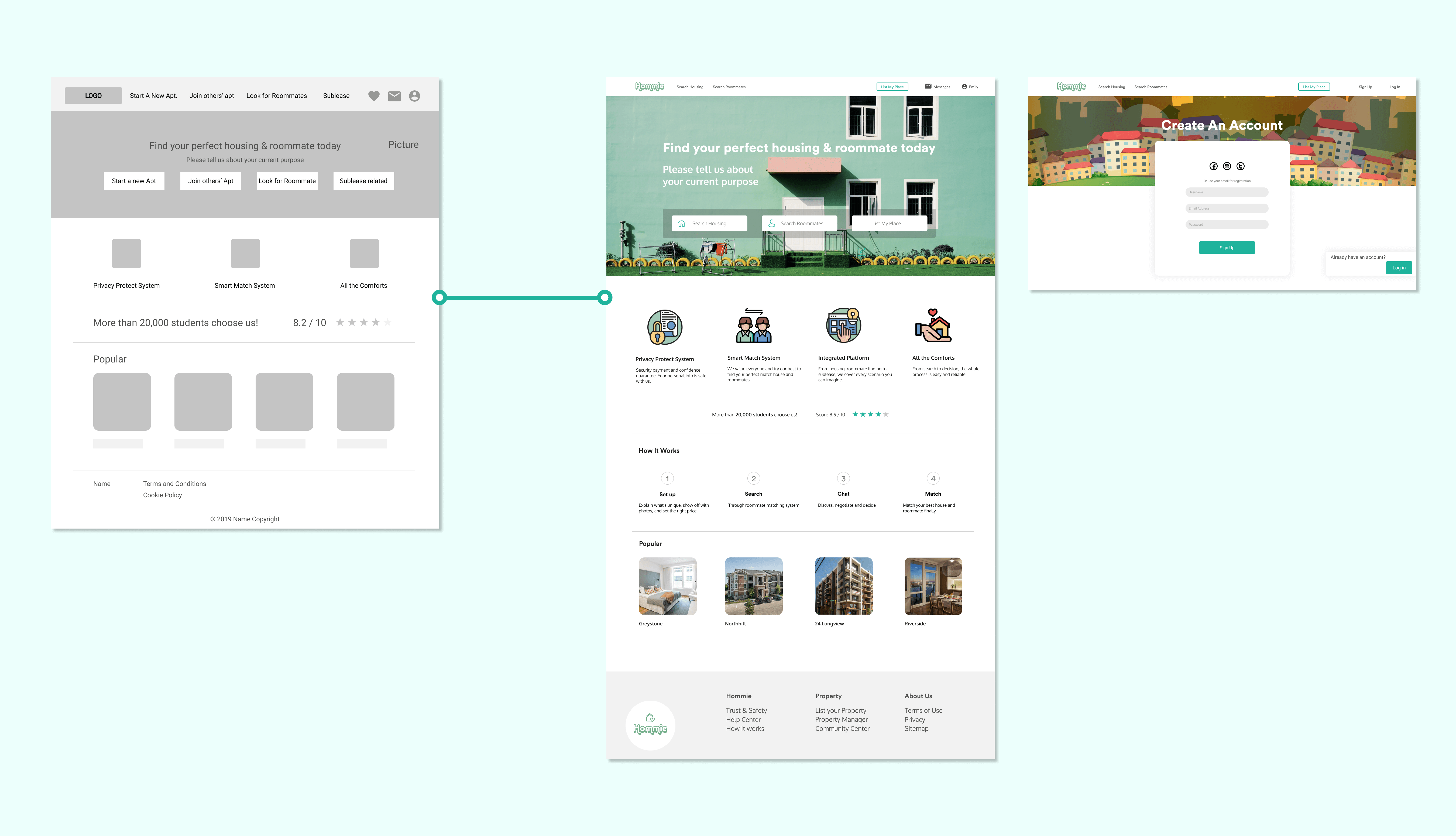
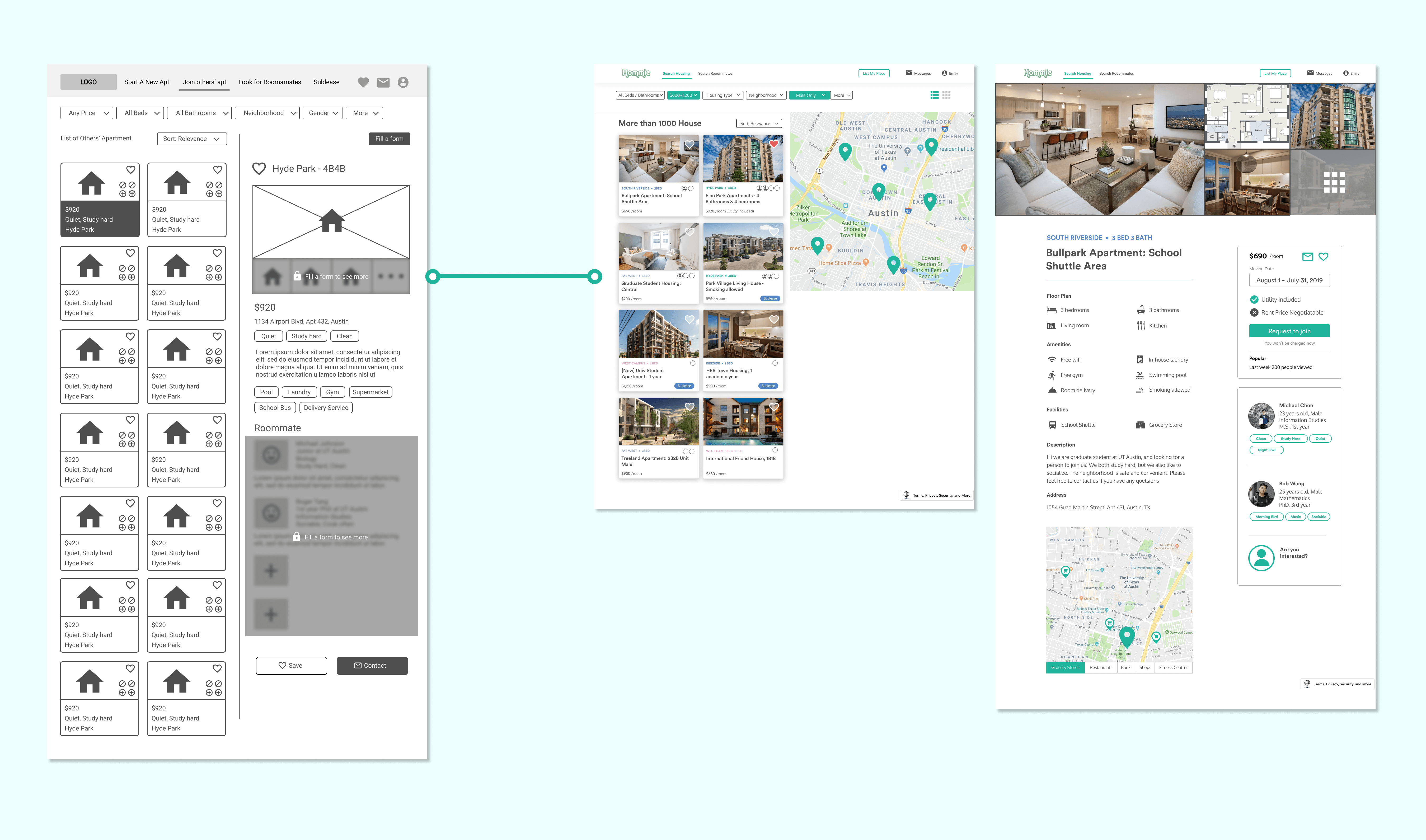
Prototyping & Testing
Through several iterations of prototyping and usability testing we refined UI designs from lo-fi to hi-fi. I was in charge of prototyping. Some examples of my works are shown below;

Examples of Changes from Usability Testing
Based on usability tests, we made changes on our design.
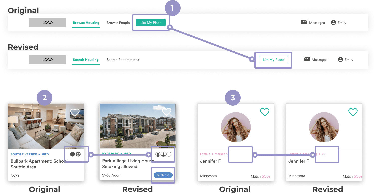
- List your place button: The original button looked already selected, and so we changed the color. Also, there are two big types of users: looking for housing / roommates and posting their places. In order to visually separate these two types, I moved the button to the right.
- Icons on the cards: We changed the icon design to better indicate how many rooms there are, and how many are already occupied.
- Age on the users' card: Sine users care about age of their roommates, we added age on the cards.
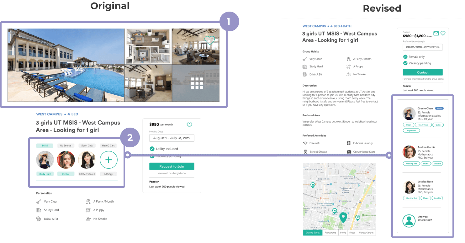
- Images of ideal housing: Users originally can put ideal house images on their groups, but others got confused, because it looks like they already have a place. So, we removed them.
- Details of group members: Users wanted to see more information of members, so we changed the design.

- Global filter: The original filter asked how many rooms you need, and then how many roommates you want. But since they usually look for just one room, and wording didn't make sense to users, we romoved the first and second filters and just put number of bedrooms and bathrooms as a filter. We also added housing type.
- "More" filter: We revised contents of "More" to make users can search by specific requirements.
You can interact with our prototype here.
What I learned from this project.
Information Architecture: I personally struggled to build our information architecture that is intuitive to users and that fits into users' mental models. Although our original structure covered all the possible scenarios, users could not easily understand that. I learned how to utilize card sorting activities and usability testing to define information architecture. Also, defining filters and metadata was not easy for me. I learned how UX designers need to consider using metadata in order to show the best results to users.
Design: It was also a hassle for me to make all the design consistent, in terms of terms, icons, themes, photos, sizes, etc. I created a design system before starting, but I think I should have more detailed and well-documented guides. Moreover, our team did not spend enough time on usability testing for our lo-fi prototypes, and then the participants focused a lot on the aesthetics of our design during our testing of our hi-fi. Thus, in order to imrove high-level structures, I would invest more time on testing during earlier stages.
Overall: In this project, I could spend a lot of time thinking of the information architecture, and so it was a good opportunity for me to learn how to better define navigation and support users' flow through UI/UX design.