Summary
[Problem] People struggle to find updated and integrate safety information about trails, including trail conditions and crime info.
[Solution] I designed Trek, a mobile application that allows active individuals to ensure their safety while participating in outdoor activities. It offers planning and safety functions so users can enjoy the outdoors free of the distractions of technology.
[My Role] I was involved in all the steps, and especially contributed to Contextual Analysis, Sketching, Mockups, and Prototyping.
Contextual Inquiry & Analysis
We conducted onsite interviews and observations to understand about out-door activities. We organized the notes into categories: enjoyment, activity pre-planning, safety (perceptions, concerns, actions), technology and observations.
Work Affinity Diagram
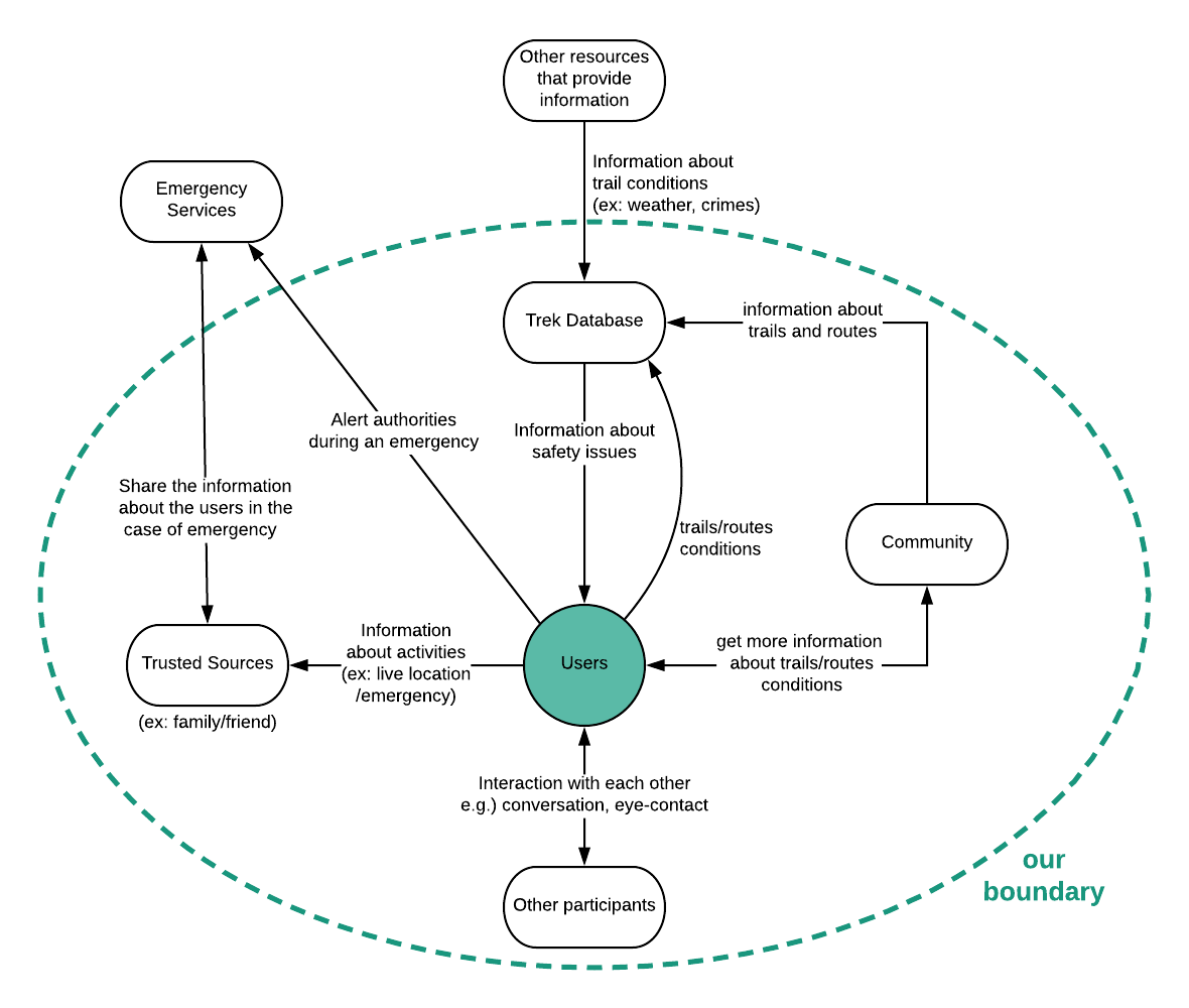
Based on the WAAD and the major / machine roles, we generated our flow model.
The major work roles are:
- Runner / Hiker / Jogger / Camper
- People who have interactions with the person
- People who can provide the safety information
- Emergency personnel including 911 (outside scope)
The machine roles are:
- GPS tracking
- Music player
- Weather tracking
- Keeping time
- Recording routes
Persona
Our persona Gwen represented a good number of our users who could utilize Trek’s features to plan safer runs. She represents the solo female runner who enjoys her outdoor activities but is also concerned with personal safety. You can see here.
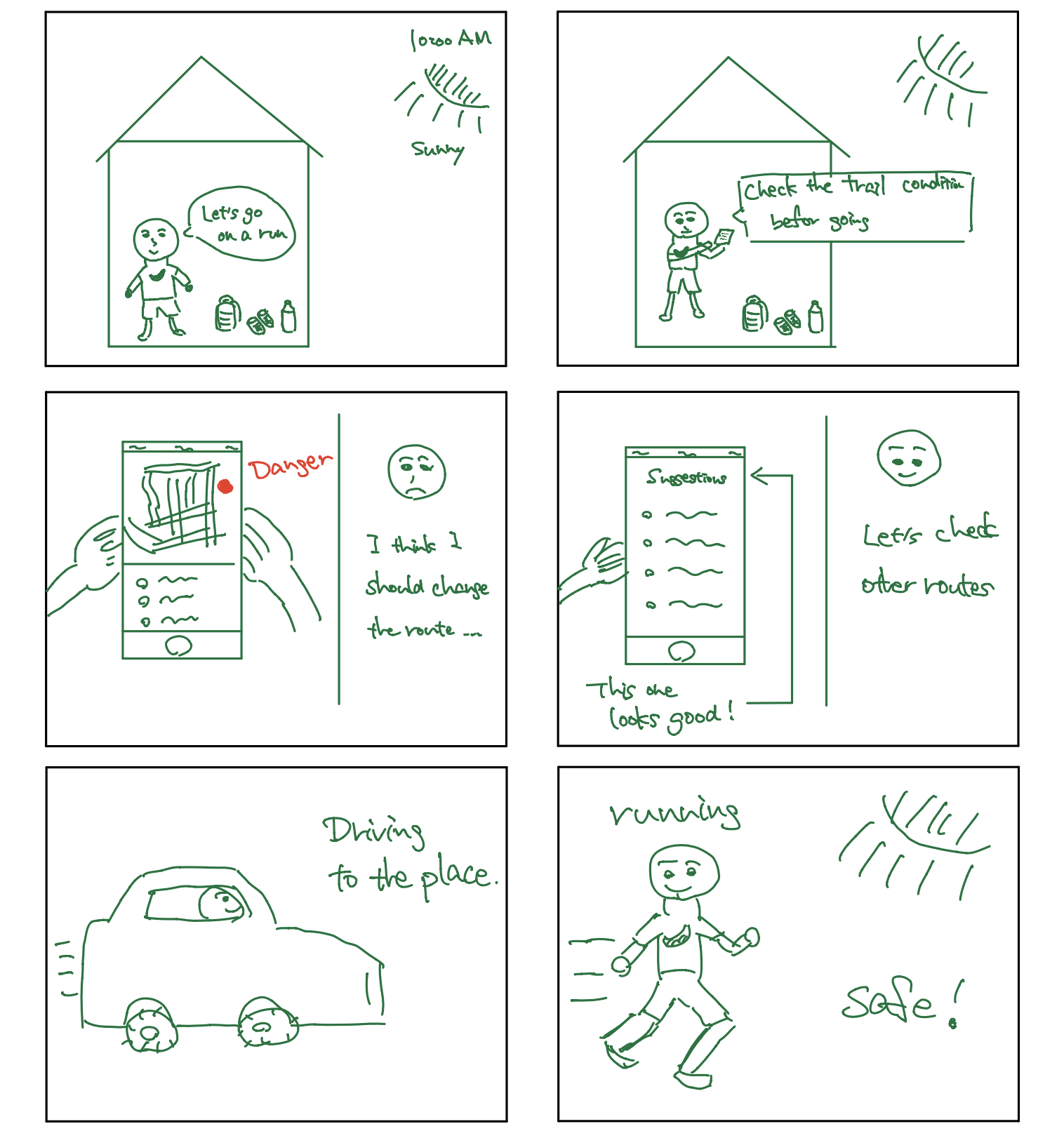
Storyboard
I created this storyboard. This proved to be an effective exercise as we identified main scenarios together but then were able to bring more specific details. In this example, a user plans to go running in a place where she often goes, but she noticed that a crime just happened there. Then, she decided to plan to go to a different place on the app.
Design Requirements
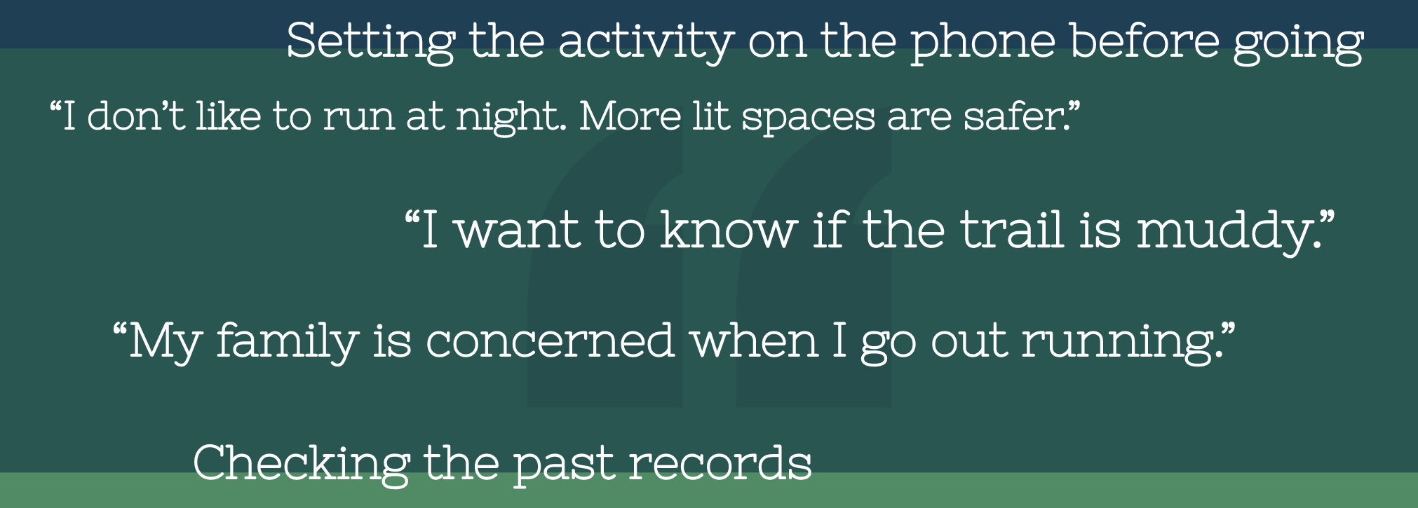
Based on our previous findings, we created design requirements. We applied a framework, in which we consider quotes, interactions, and features in this order.
- [Planning/Updating] Access to current trail / route conditions
- [Planning/History] Recording and accessing routes / trails
- [Activity Mode] Distraction free from technology during activities
- [Safety] Keeping family/friends (trusted sources) informed
- [Safety] Physical safety and emergency situations
Designer’s Mental Model & Conceptual Design
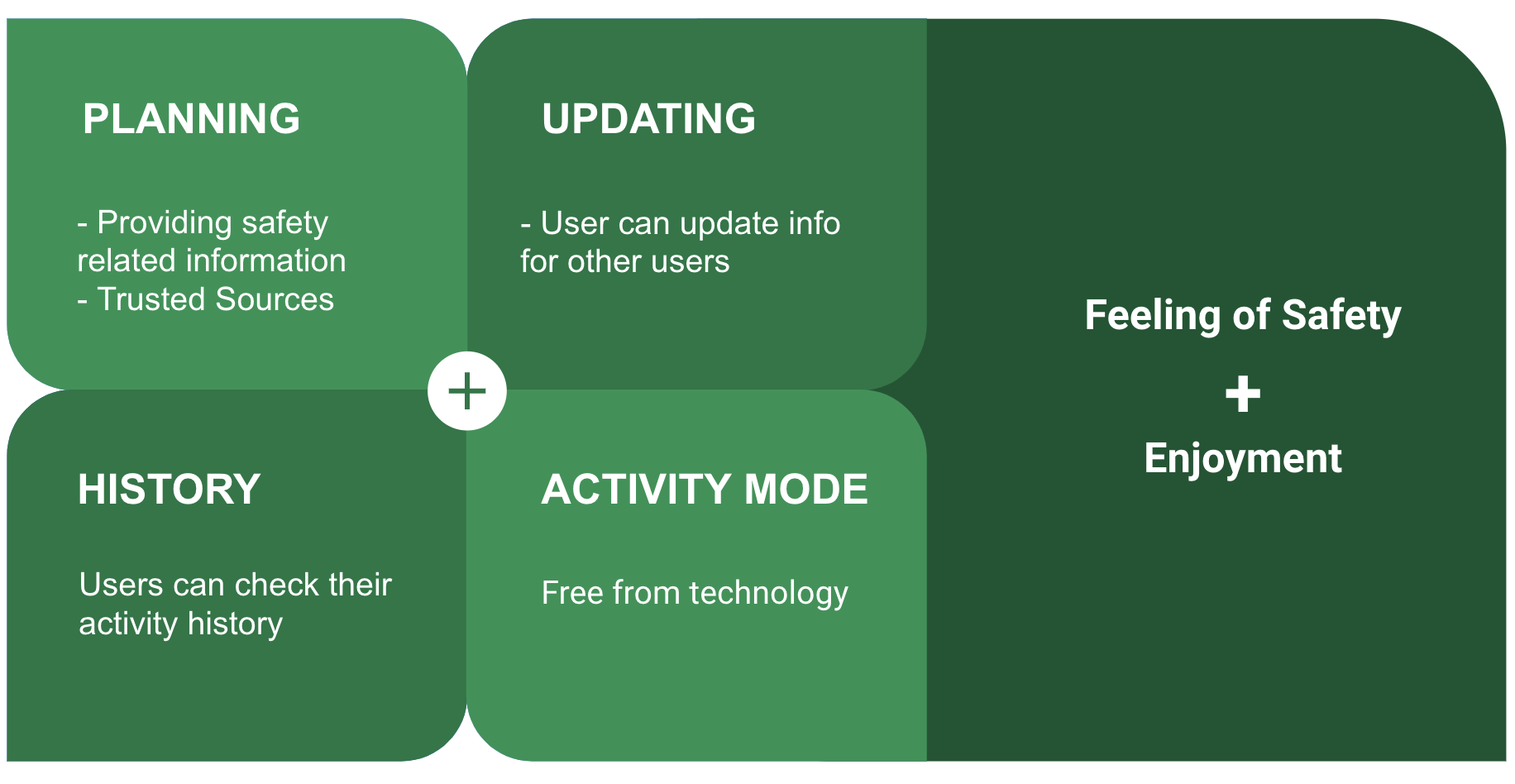
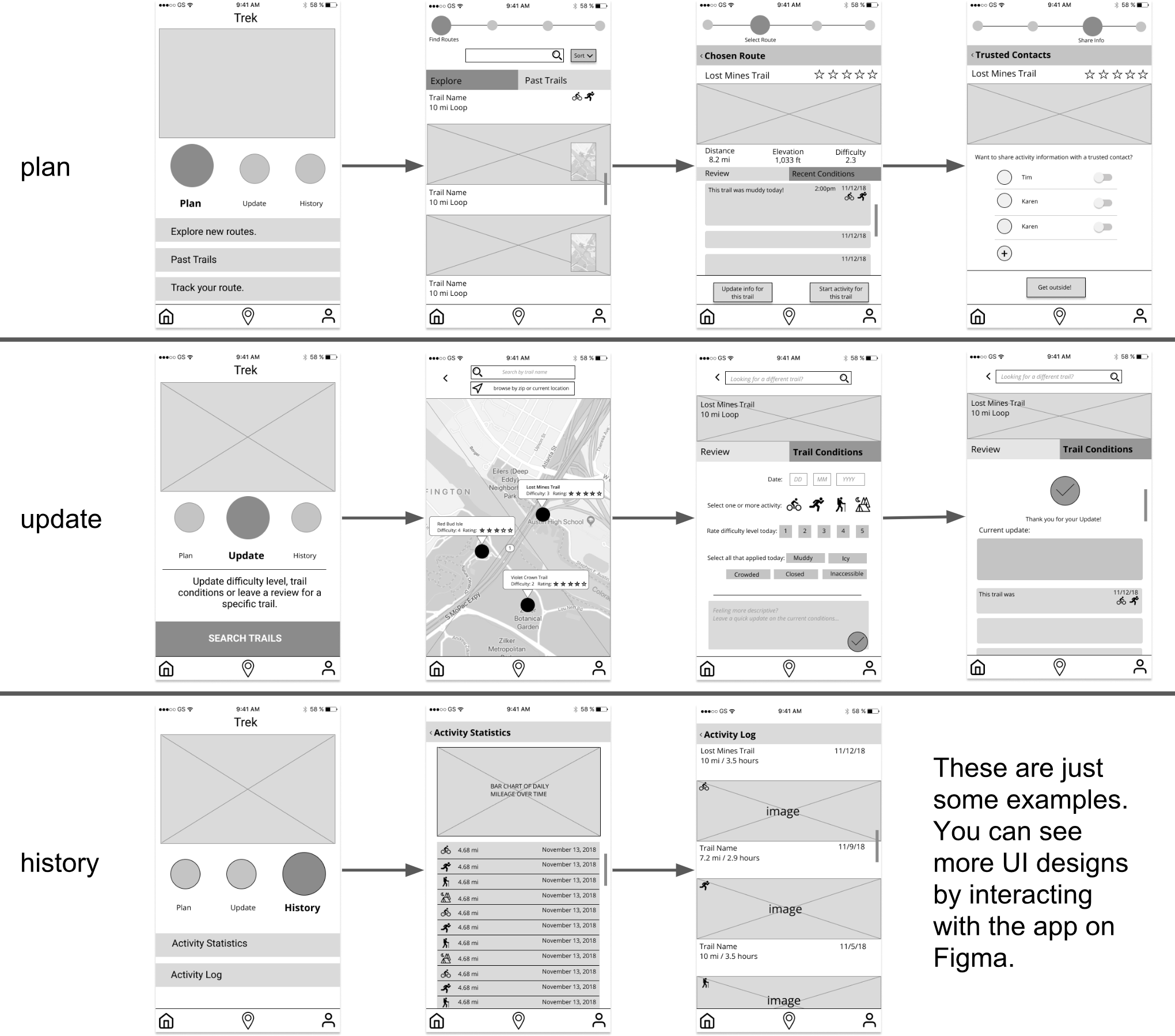
Ecological Perspective: Our app consists of users’ personal portals but is also part of a larger network of Trek users and other outside sources. It has three main functions: planning an activity, updating trail/route information and looking up your history of activities.
Interaction Perspective: The user will physically use the phone when completing tasks like planning a route or looking up trail information but can either put their phone away so they can fully enjoy their outdoor activity.
Emotional Perspective: We envision our app to allow users to enjoy the outdoors without the burden of worrying about personal safety. The user has the ability to update trusted contacts with information on their wellbeing which instills a sense of security for both parties.
Models
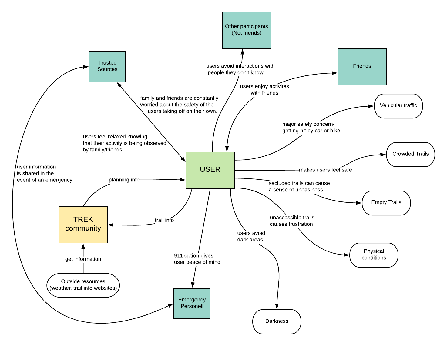
Social Model: Safety is an emotional subject. We created a social model, because it centers around the “feelings, issues and concerns” and how they affect their behaviors in this context.
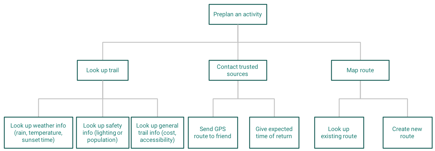
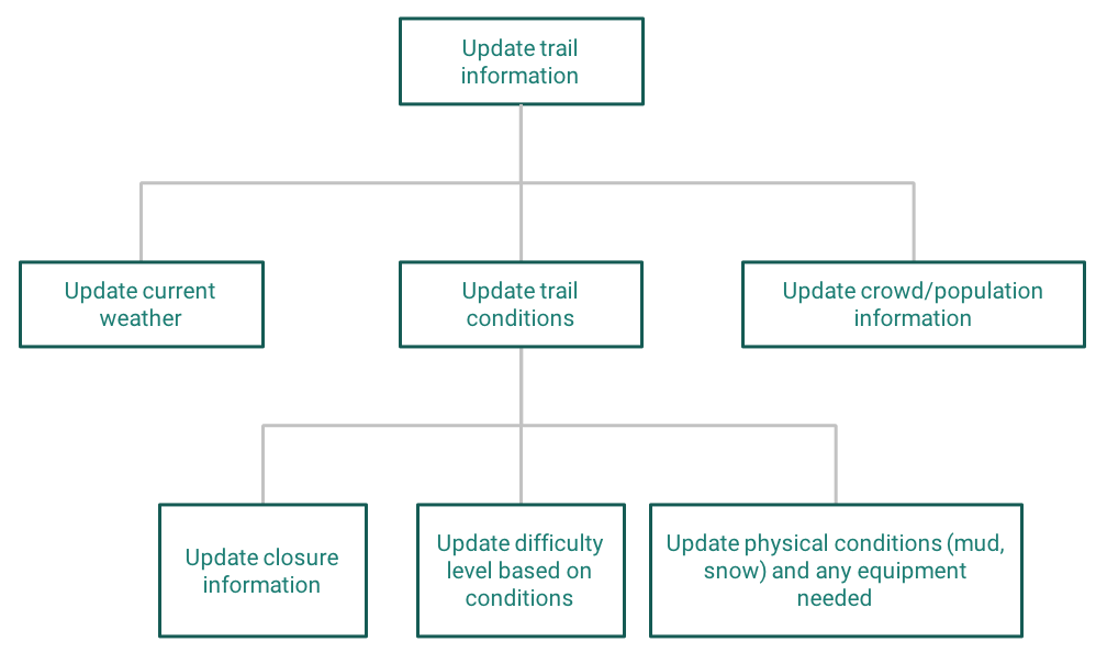
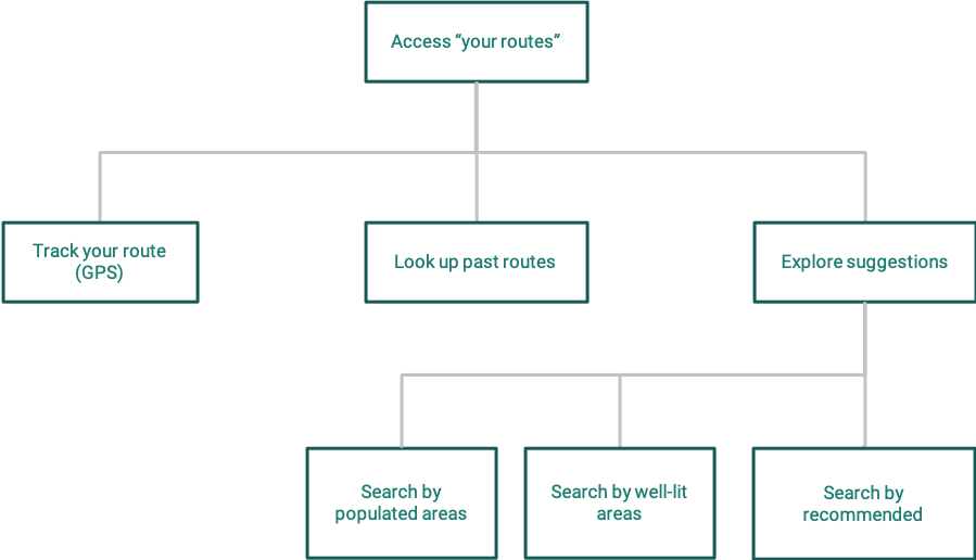
Hierarchical Task Inventory: helped us map out user goals. It allowed us to talk through each task and understand the system. See the full document to see more.
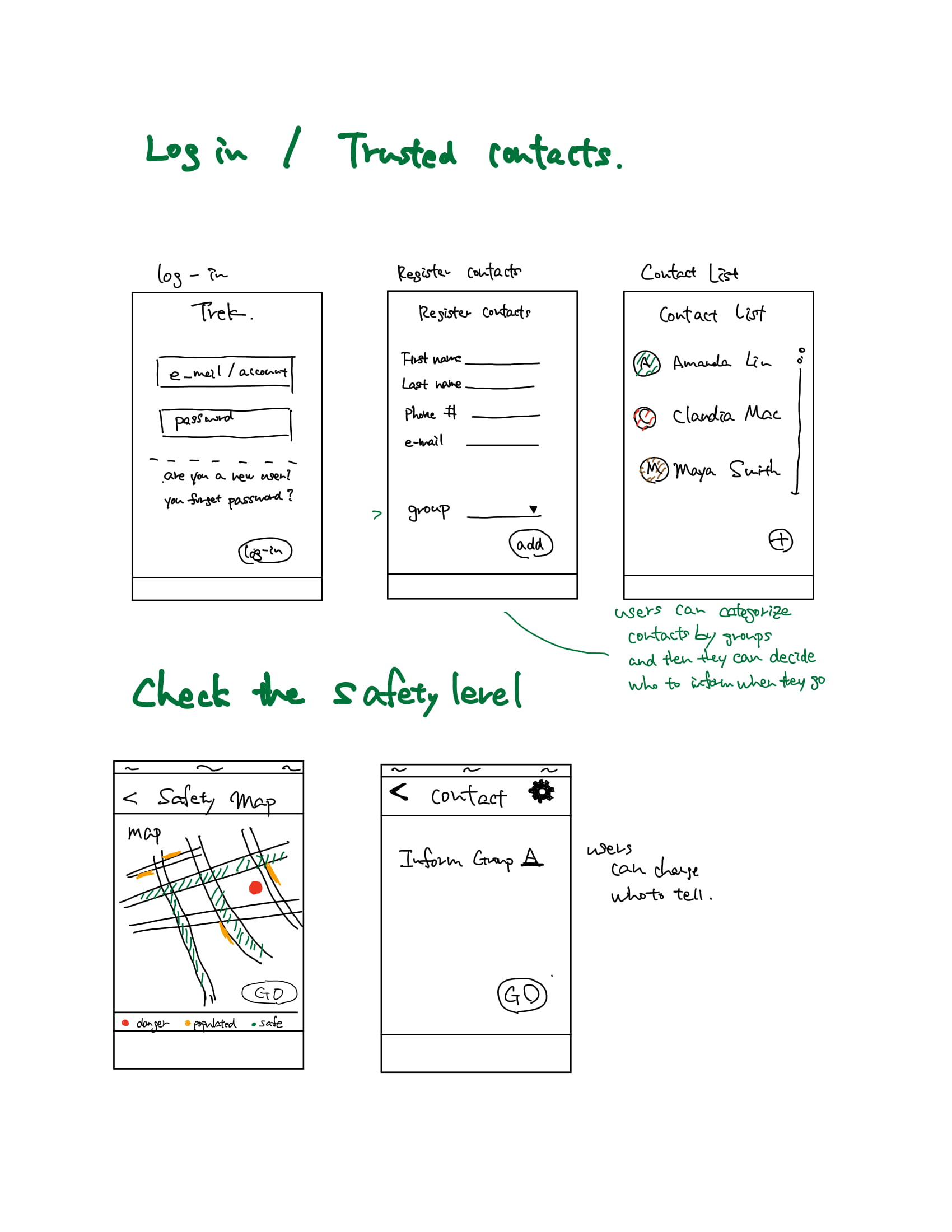
Sketch
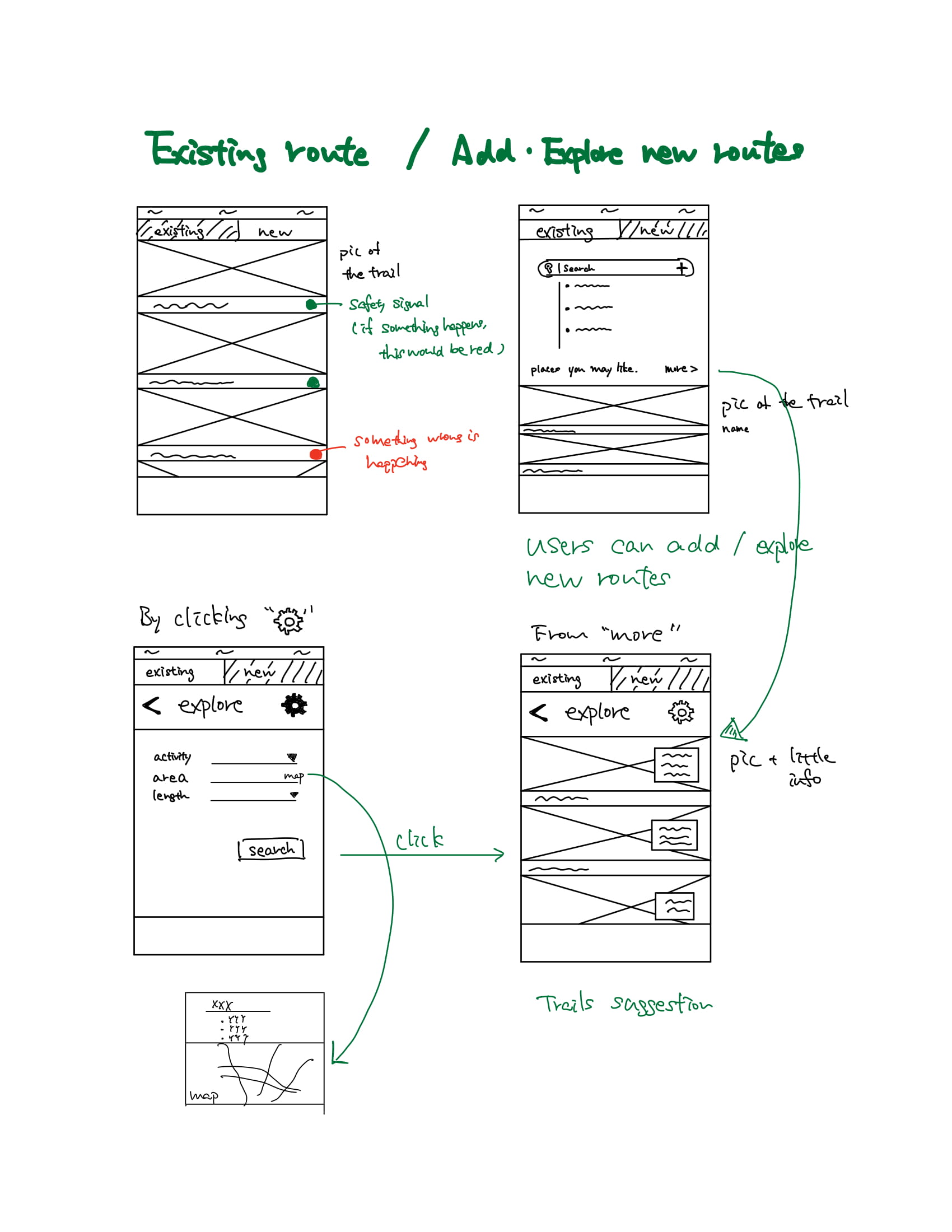
We conceptualized screens for main functions, based on previous steps. (Especially, the hierarchical task inventory)
Wireframe & User Testing
Based on the previous steps, we created our low fidelity designs with some user testing sessions.
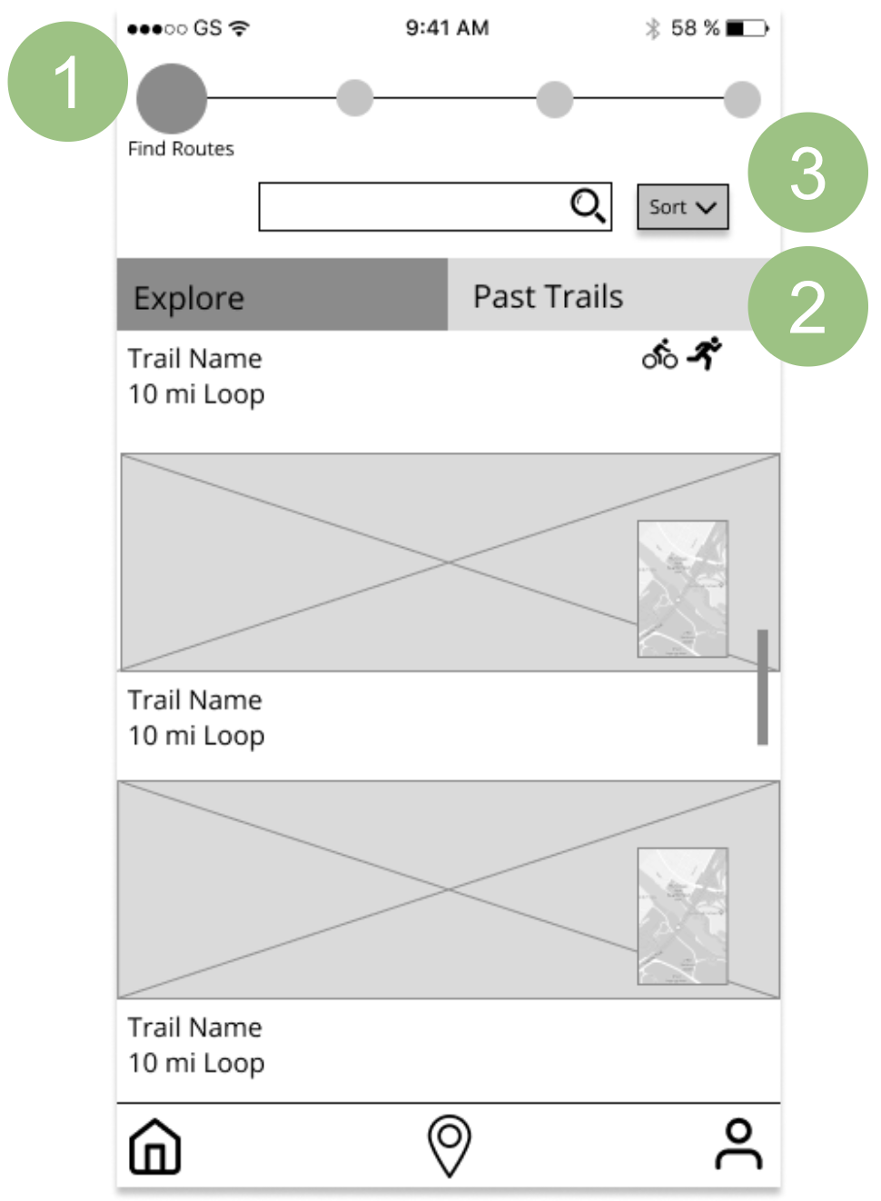
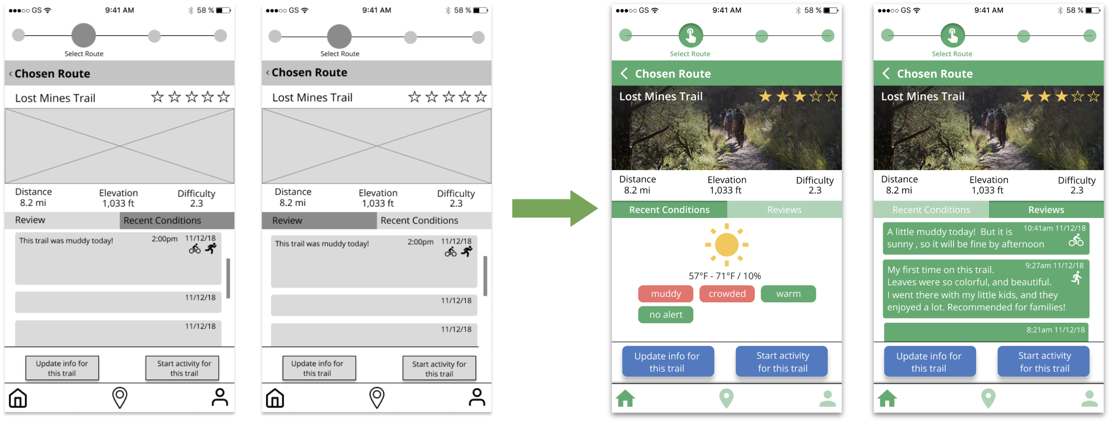
To refine our designs, we conducted user testing with five participants. An example of the changes is shown.
- On our initial lo-fi, the circles on the top were bigger so that our participants clicked them to progress the process. Thus, we made them smaller.
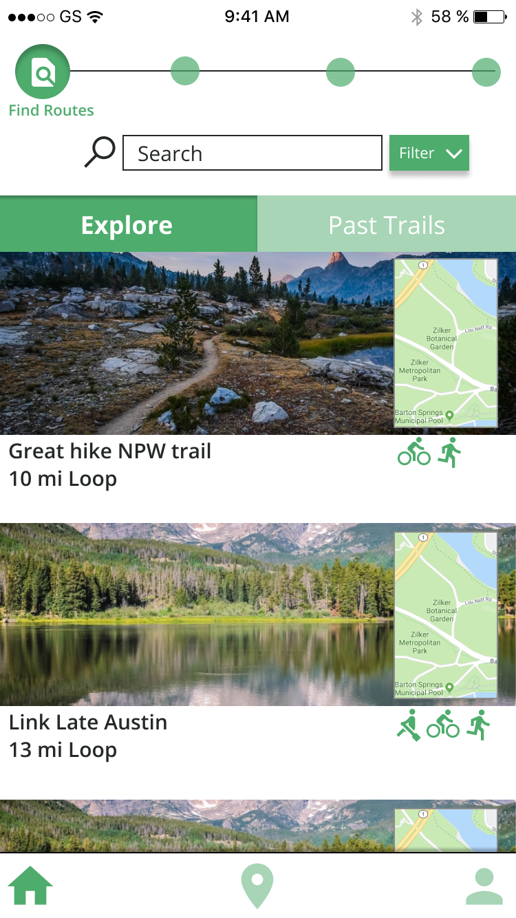
- On our initial lo-fi, we worded "Existing Route" instead of "Past Trails", but the participants were confused. So, we changed the wording to "Past Trails"
- Our participants wanted to sort these activities. Thus, we decided to enable users to sort in different ways. (chronological - default, frequency, time length of the activity, etc)
Heuristic Evaluation & Cognitive Walkthrough
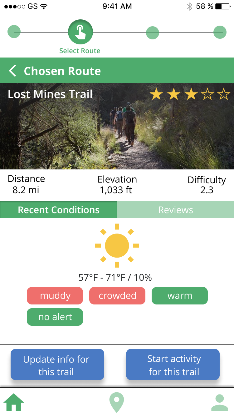
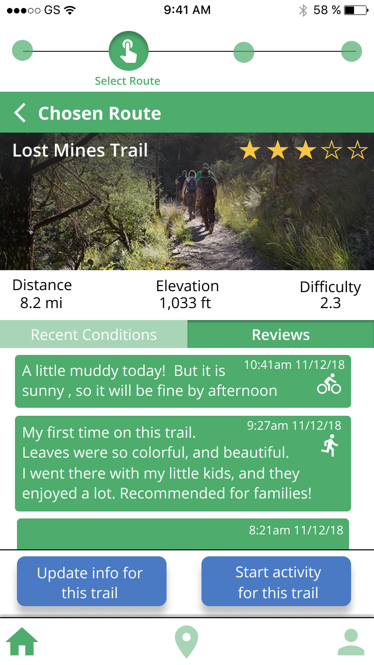
We performed heuristic evaluation and coginitive walkthroughs to evaluate our prototype. The "chosen route" screen for example had some issues.
- The screen is too crowded and has too much information.
- Confused about the difference between "Review" and "Recent Condition", because these had similar UI.
- Confused about whether "Recent Conditions" or "Reviews" is selected
To solve, we made some changes.
- By adding more visual elements, icons and colors, I avoided having too much texts.
- "Recent Conditions" has visual elements of the conditions, while "Reviews" appears like Twitter, so users see these are reviews.
- By adding colors and inner shadow, I made it obvious which button is selected. (Recent Conditions / Reviews)
High-fidelity Prototype
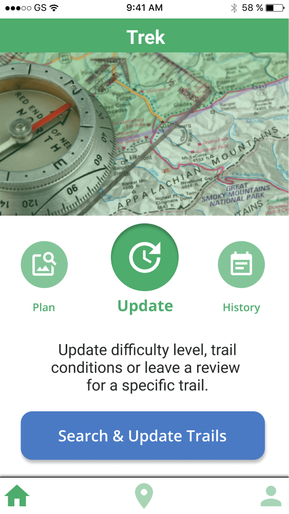
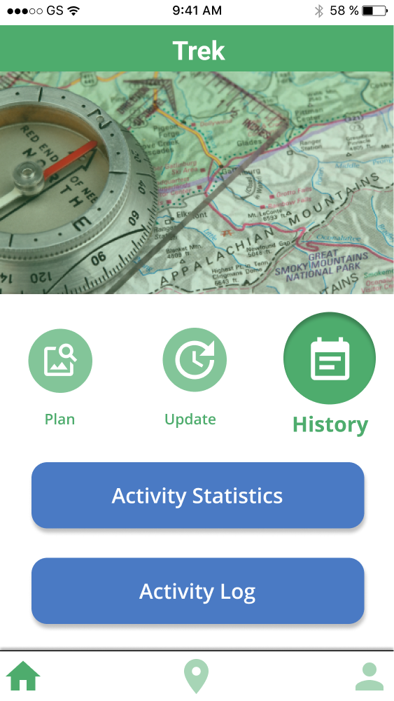
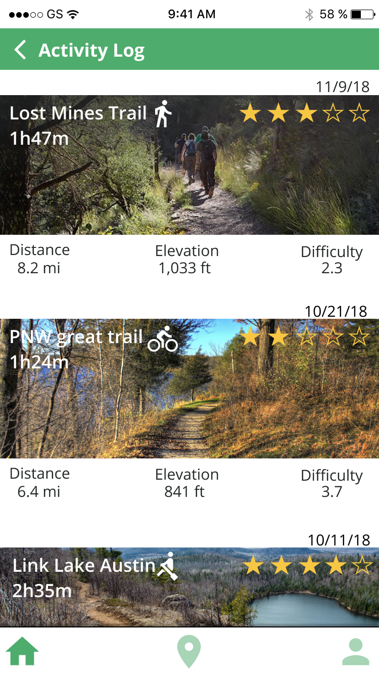
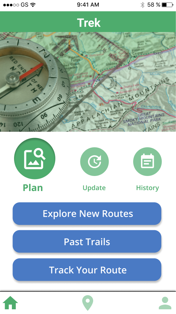
I created our high-fidelity prototypes. Here are some examples. For the "plan" function, users can choose a route, check the conditions, and then decide whether to go or not. For the "update", users can update the condition by themselves. There are two types of updates: recent conditions and reviews (their opinions about the trails). For the "history", users can see the list of their past activities and the details.
What I learned from this project.
At the very first stage of this project, even though we all agreed to create an app for "safety", I was thinking safety in the urban setting while my teammates thought more about safety in nature. This difference made the progress slower at the beginning, so I think we should have spent more time on the initial concept and agreed on the trajectory of the project. However, our onsite contextual inquiry including interviews and observations helped me a lot to understand the current condition and what we should focus on.
For the ideation and design stages, I struggled with what functions our app should include and what to ignore. Since our topic was very broad (safety and enjoyment of outdoor activities), it was not easy for me to conclude which specific painpoints we would address. Based on the models, persona, and storyboards, we decided to focus on "trail conditions", and so in our app, users can see the current trail conditions easily during planning and activities. However, through the user testing, participants were confused about some of the concepts, such as "update". Thus, I learned the importance of user testing to fill the gap between designers and users mental model.
"Trek" was a fun project. I hope I will have another chance to do an outdoor activity related project someday.
