Summary
[Situation] The Texas Highways's website provides readers with a curated articles and information to the state’s cities, unique cultures, hidden gems, and natural wonders. But their website for mobile devices was not well-designed, and so they wanted to develop a mobile application for Texas Highways.
[My Role] I worked with them as a UX designer, and designed the mobile application of Texas Highways.
[Process]
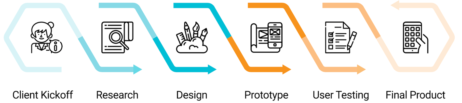
Kick Off Meeting
Goal:
Create a high fidelity concept and design of the Texas Highways
mobile application in order to improve customer's experience
on mobile devices.
Attendees:
- Joan Henderson (Director)
- Mark Mahorsky (Creative Director)
- Andrea Lin (Publisher)
- Emily Stone (Editor)
Takeaways:
- The Texas Highways’s purpose is to drive tourism in Texas
- We want to make the app less of a corporate feel, and more fun
- One of the focuses is scenic routes in Texas
- We want the app to be engaging
- The current main users are over 40. While we plan to keep them, we also want to attract young people.
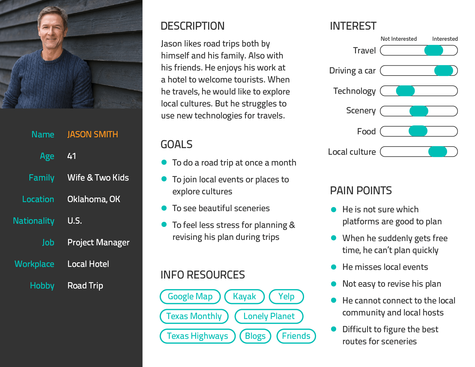
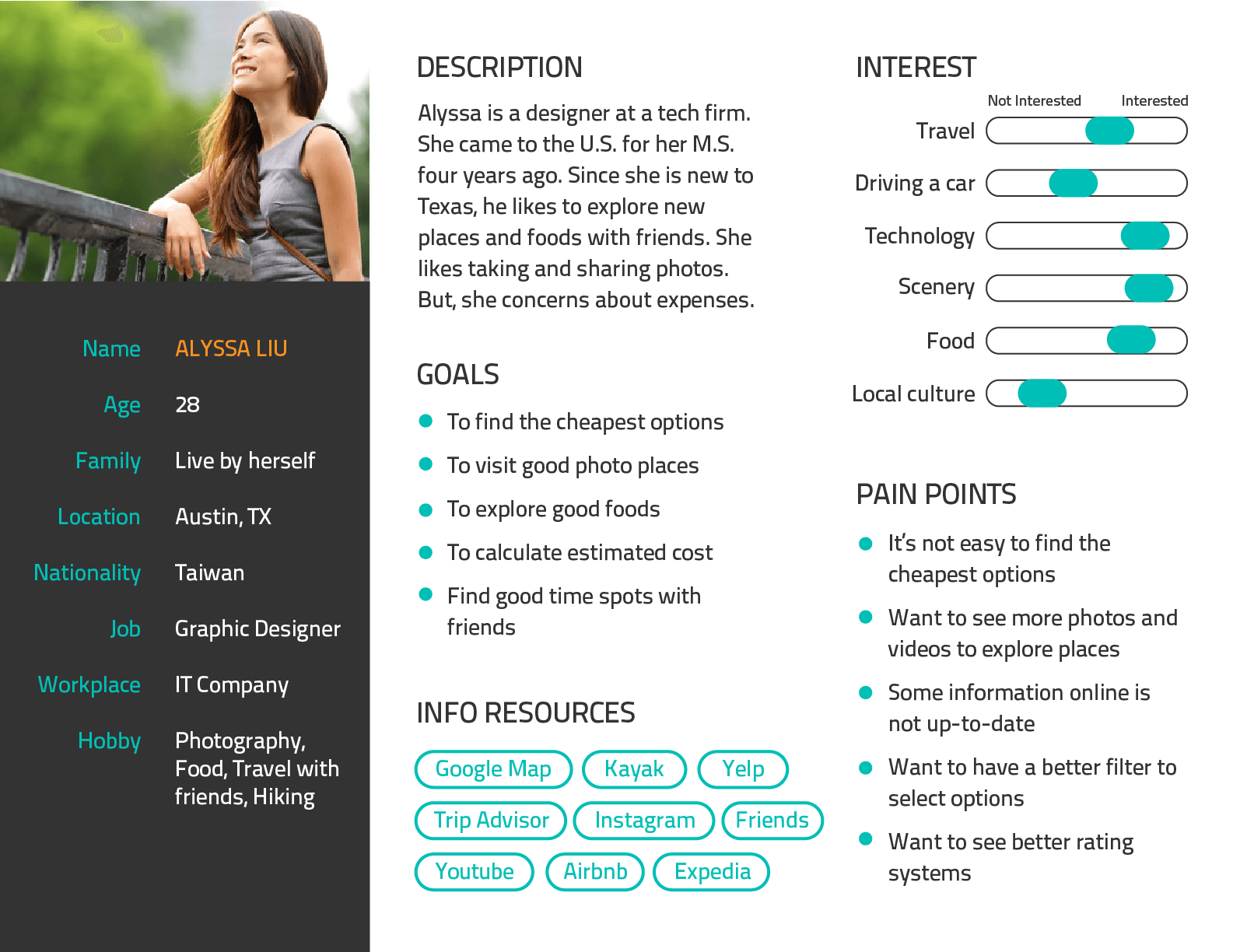
Persona
Based on the given interview data of eight target users, I produced two personas. These two represent:
Current Users: Over 40s, Local people, Having family, Like exploring cultures, etc
Potential Users: Young people, Familiar with technology, Limited budget, etc
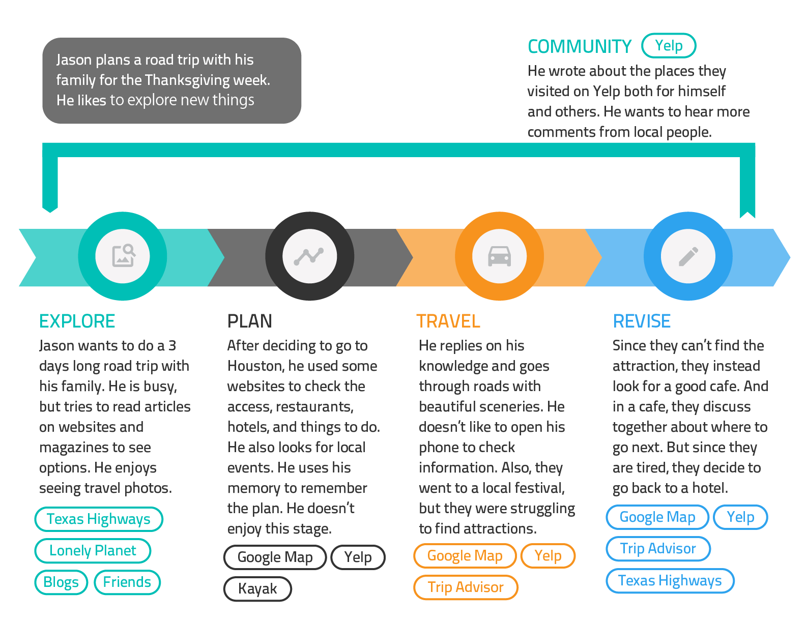
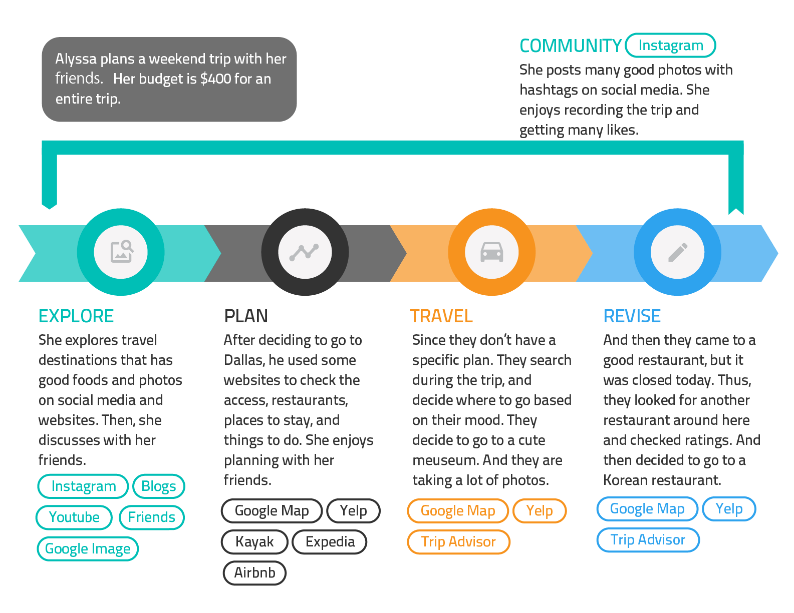
Scenario
Based on the previous steps, I created two scenarios for Jason and Alyssa. From the research, I learned there are five stages during a trip.
- Explore: Users explore travel options. (where to go, what to do, etc)
- Plan: Users make a specific plan. (hotels, transportations, schedule)
- Travel: Users actually travel.
- Revise: Users revise their plans according to the different situations.
- Community: Users share their experiences. This happens anytime during the process.
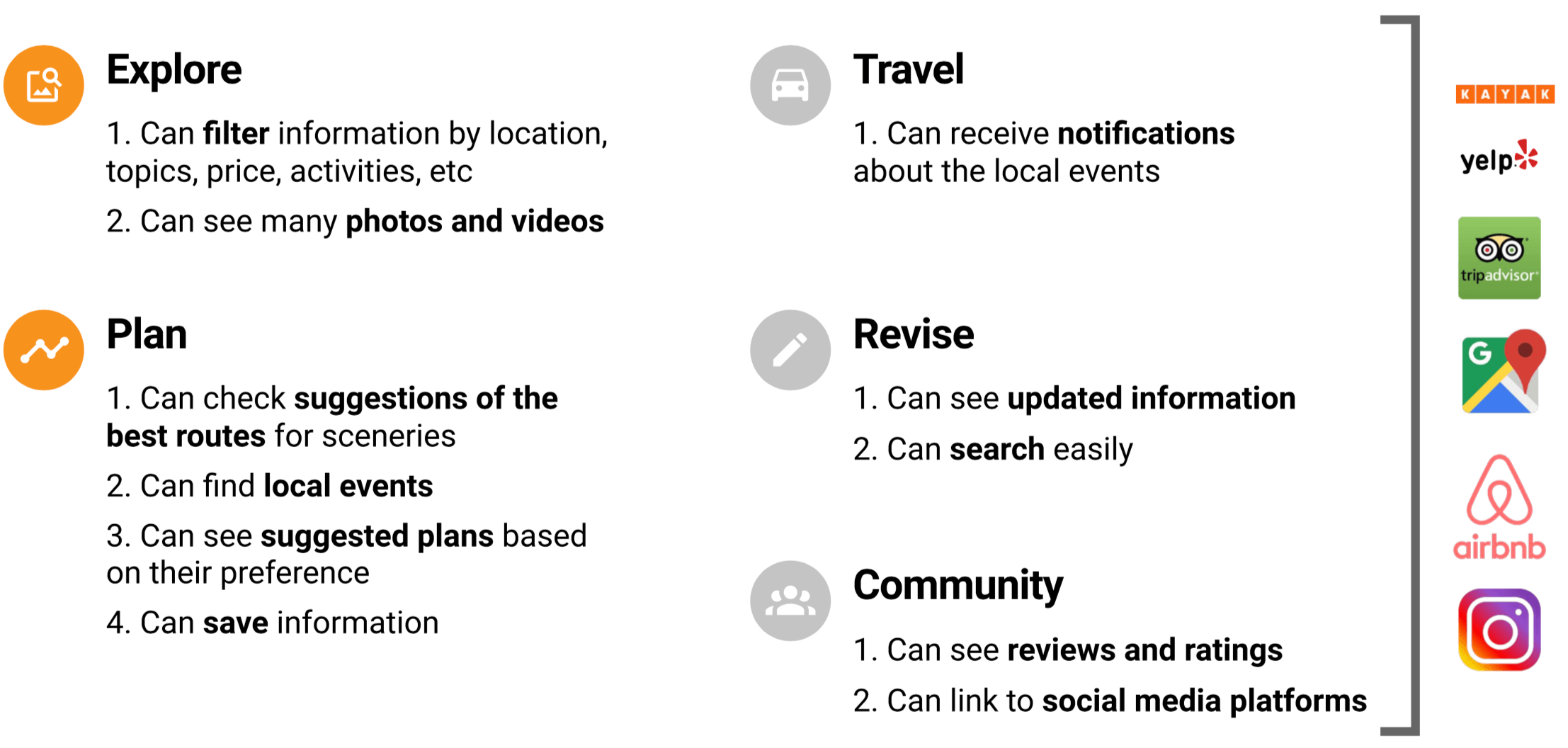
User Requirements
Based on the research and competitive analysis, I extracted main requirements for each step.
Although our app provides functions for all the five stages, the main focus will be "Explore" and "Plan", because;
- There are many existing services for "Travel", "Revise", and "Community".
- Texas Highways already has many articles to support "Explore" and "Plan".
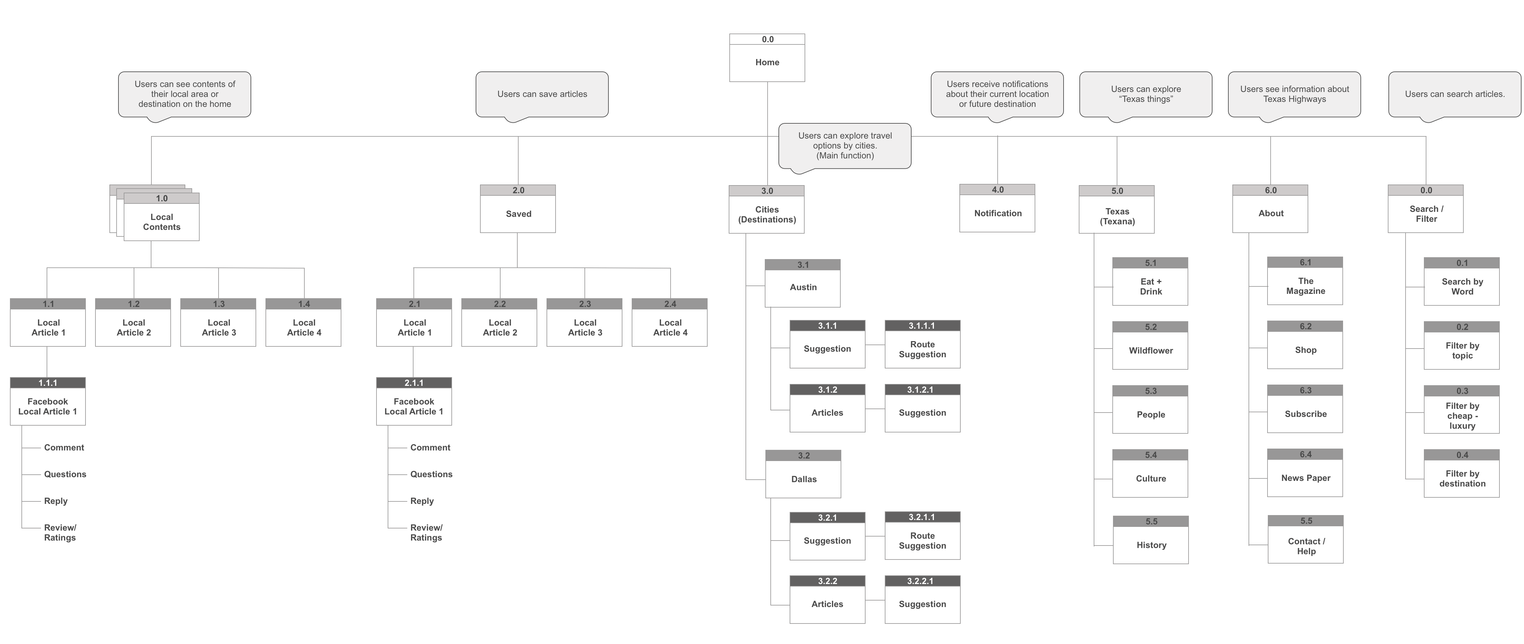
Site Map
After the UX research, I created a site map, while considering the original information architecture of Texas Highways. (The one shown here is the final version)
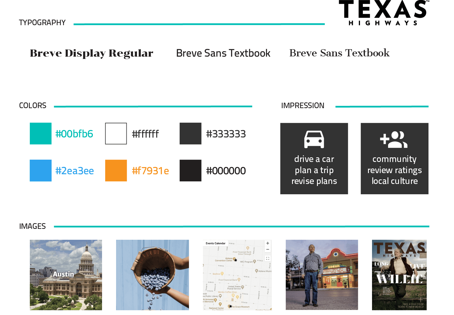
Design Guide
Before starting UI design, I created a design guide to design in a similar way with the original Texas Highways website.
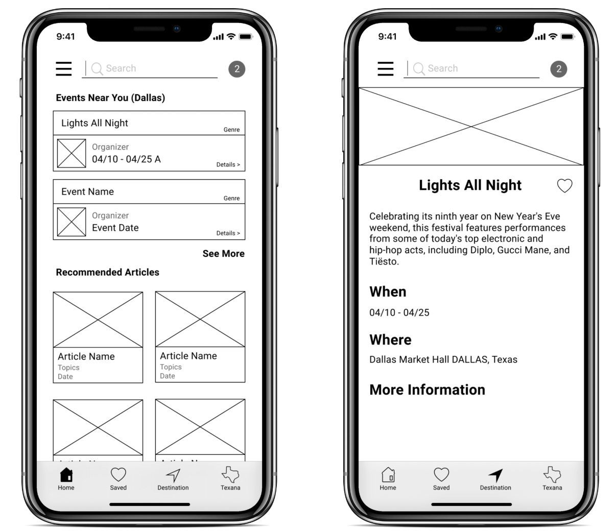
Low-fidelity Prototypes
Visualization of initial ideas based on the research and site map
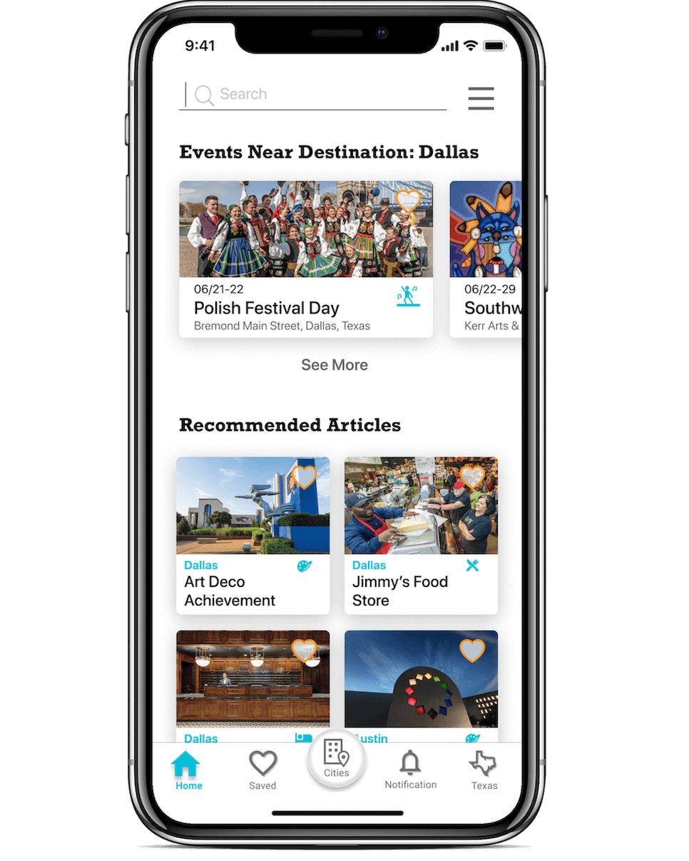
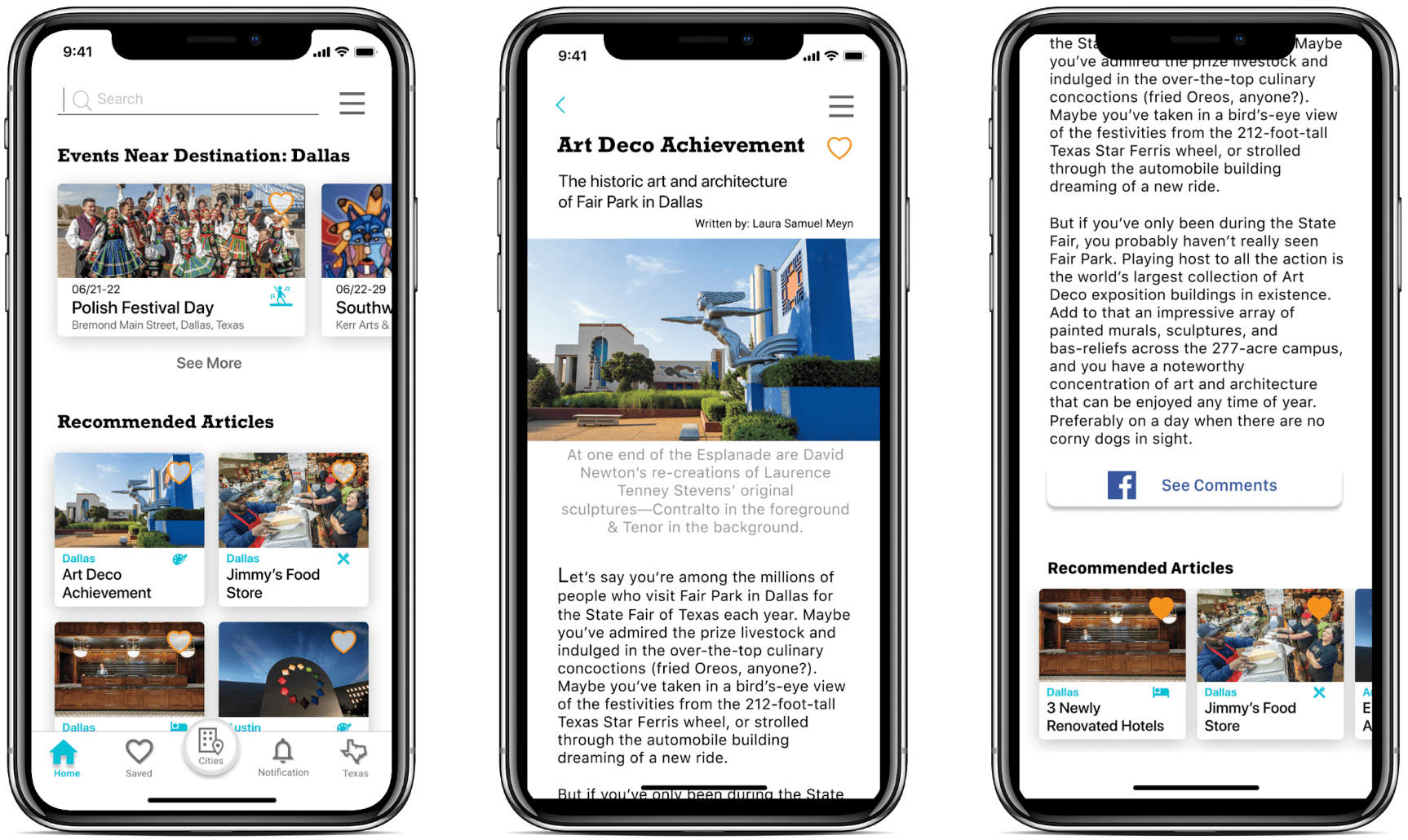
The home screen on the left shows:
- Hamburger Menu: for information of Texas Highways
- Search Box: Users can search by cities, topics, price, etc
- Notification: Number indicates how many notifications users received
- Events near you: Events around users' current location or future destination
- Recommended Articles: Show articles based on users' location and search/view history
- Global Navigation: This stays here for all the screens.
The event screen on the right: By clicking one of the events on the home, users can see the details.
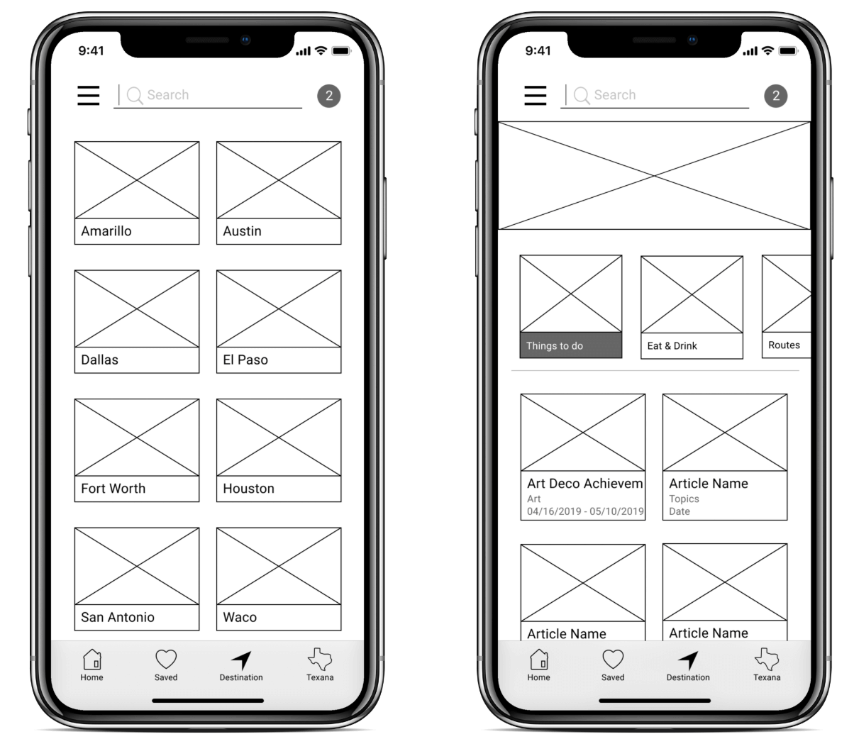
The destination page on the left shows several cities & towns in Texas in alphabetical order. This helps users "explore" and "plan".
The destination information page on the right shows articles about the city or town. Articles are categorized by "Things to do", "Eat & Drink", and "Route".
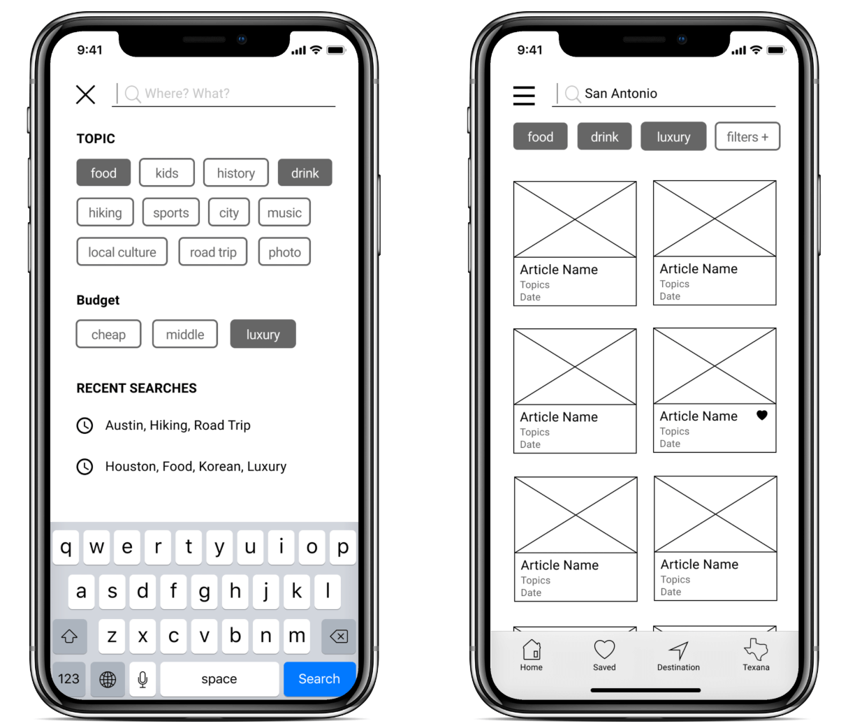
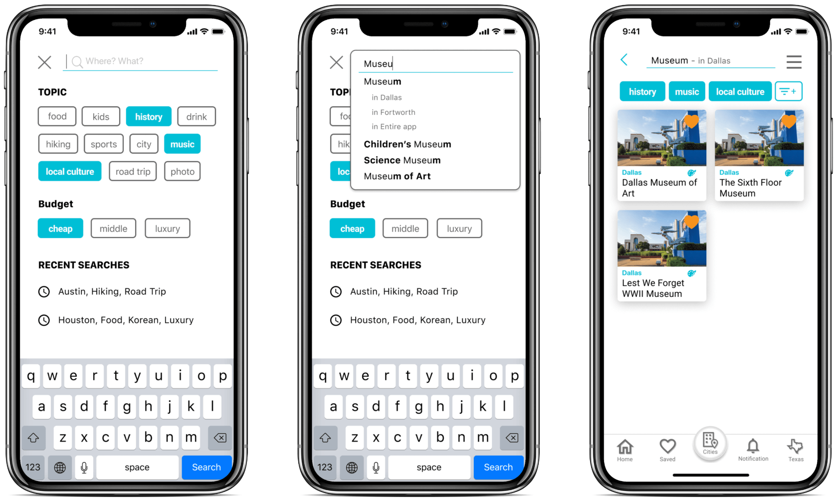
The search page on the left lets users search articles or information by words. They also can add filters by selecting topics.
The search result page on the right shows articles and information. Users can edit filters here.
User Testing Main Findings
- Users tend to use "search" instead of "destination", even though we want to make users use "destination" to explore more articles.
- Users were confused about "destination", because of the label and icon.
- Although the "notification" function is important, just showing a number in a circle was confusing.
- Users can be confused if they are searching in the entire app or in a specific destination.
- Users first explore in "destination", and then once they decide where to go, they use "search" more often.
Main Implementation
- To encourage users to use "destination" function, I decided to emphasize the destination button by design.
- I changed the icon of "destination", and also changed the label to "cities".
- The "notification" was moved to the global navigation at the bottom.
- The "search" function allows users choose to search in either the entire app or a specific destination.
- Our app needs to emphasize both "destination" and "search".
High-fidelity Prototypes
Through three rounds of prototyping and user testing, these final prototypes are created.
The home page on the left
The article page on the right. *Users can see others' comment on social media and also find recommended articles.
The cities page on the left
The city information page on the right. *Place to stay is added here.
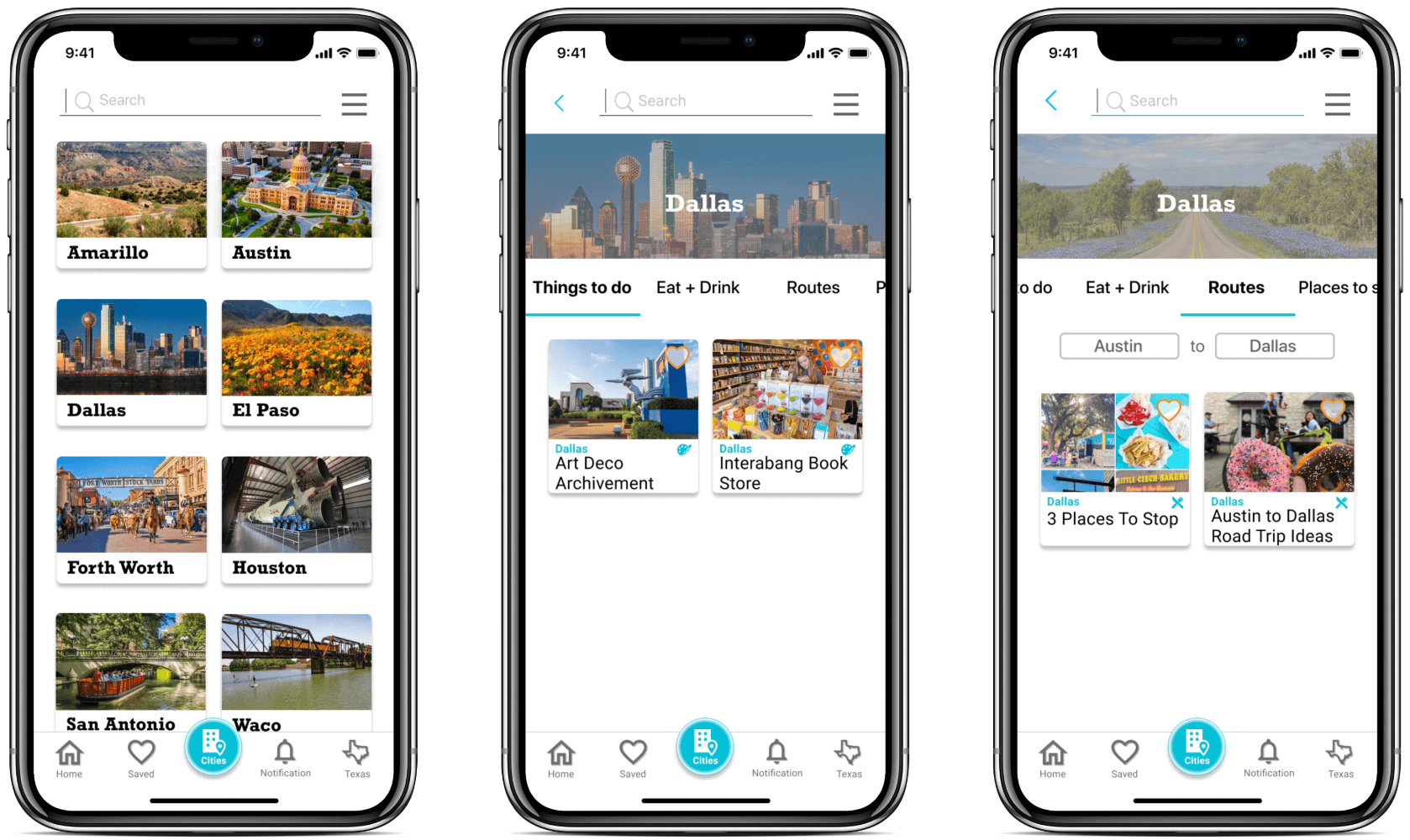
The search page in the middle allows users to choose whether to search in the entire app or a specific city
Thank you for reading this project to the end.